Self-initiated
Stencil Typeface SETT
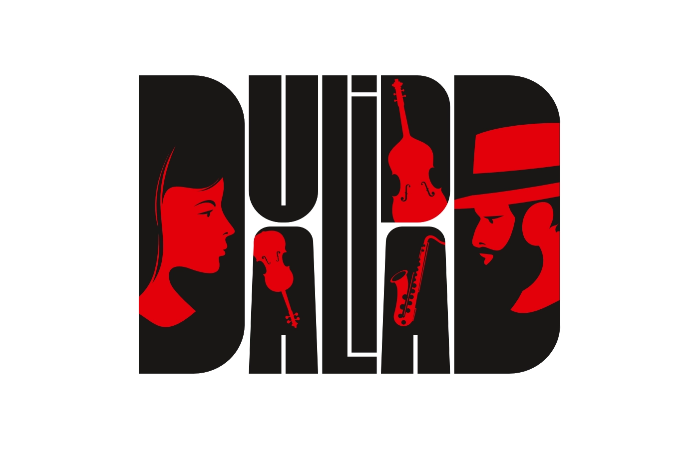
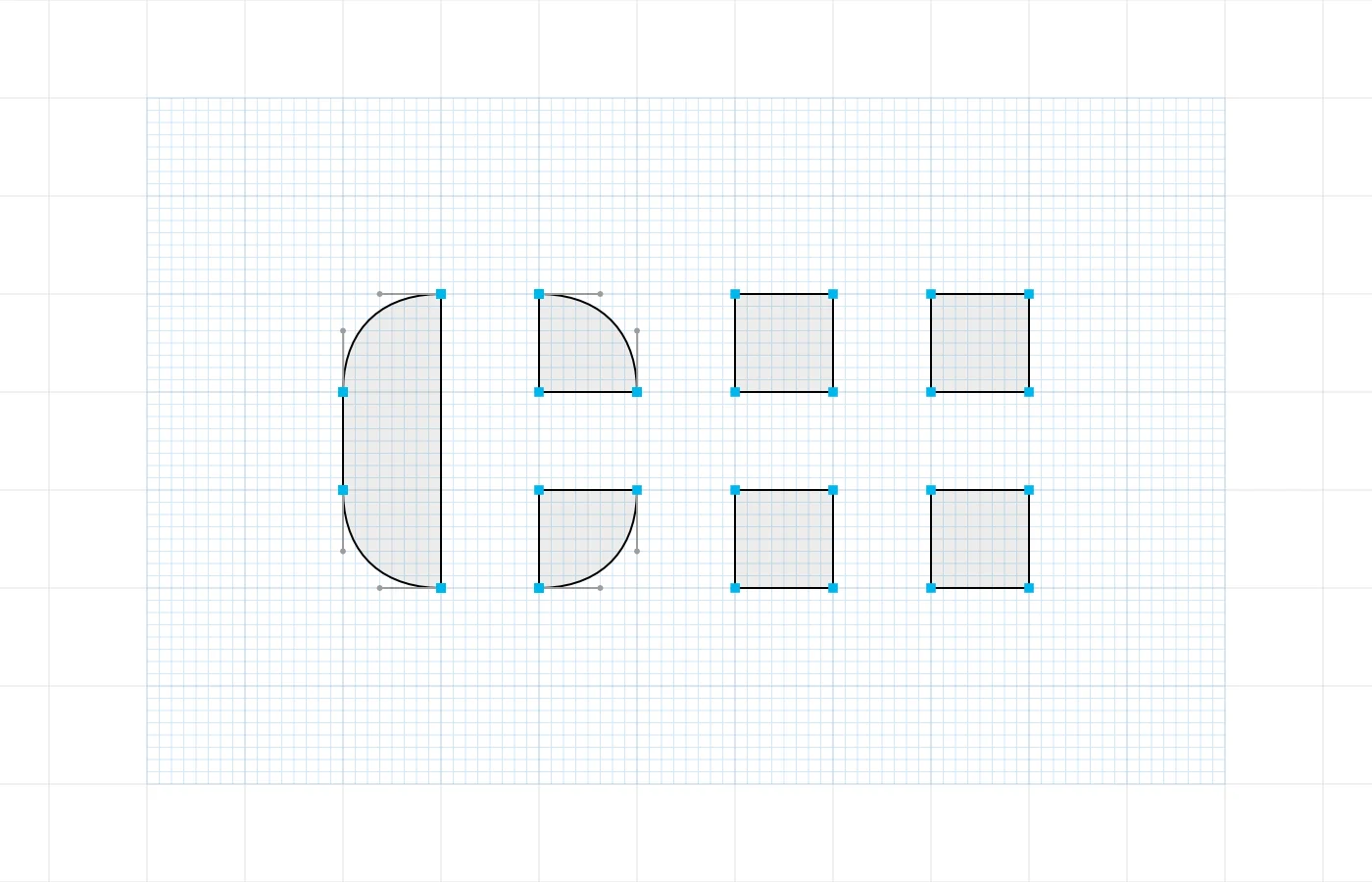
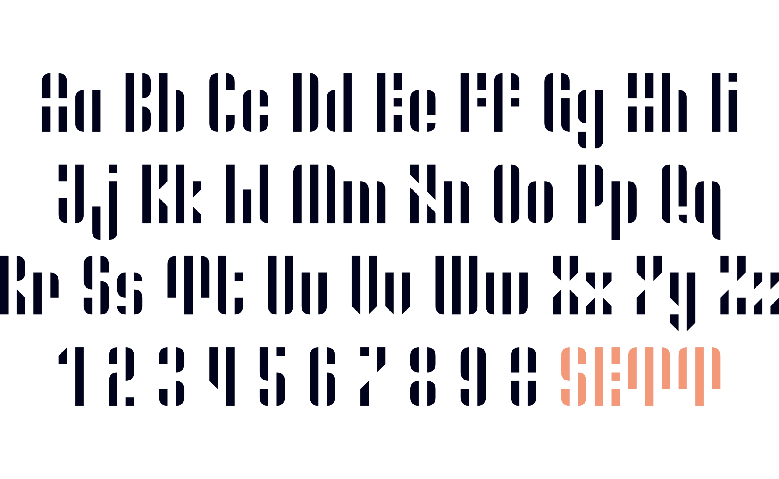
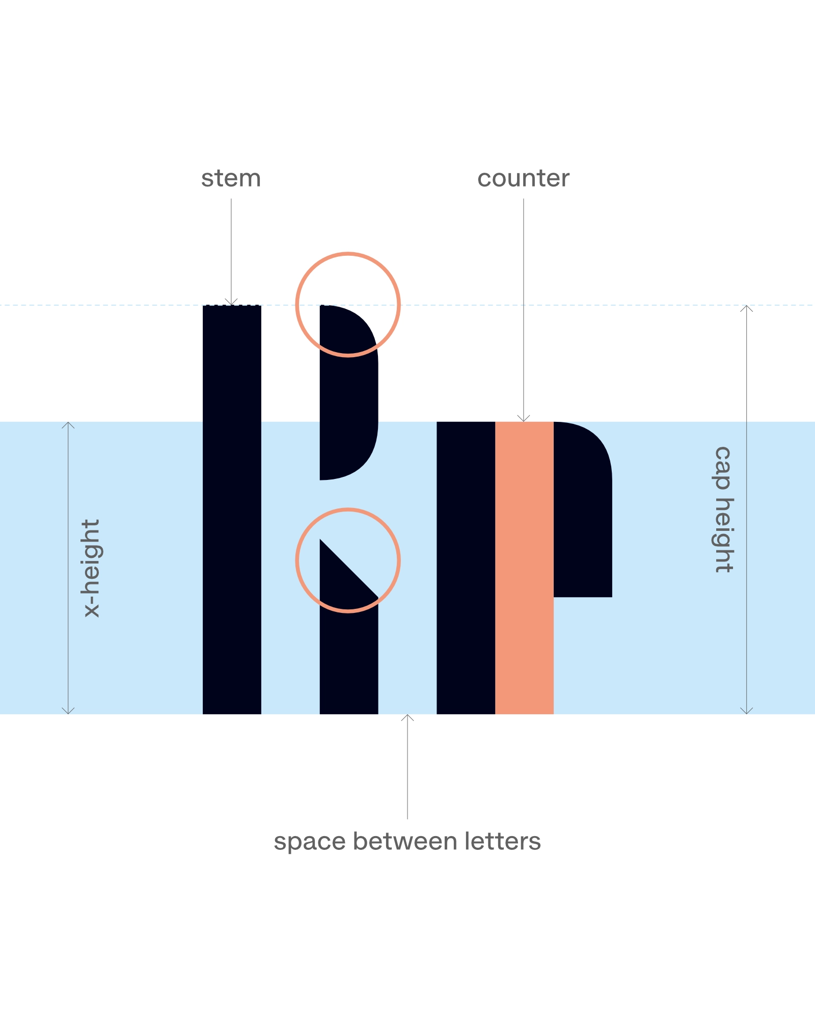
Sett is a geometric stencil typeface built from a single rule: every glyph consists exclusively of vertical strokes. The width of every stroke, counter, and the space between letters is determined by the same unit, creating a continuous rhythm of black and white.
The reductionist principle is most visible in characters that usually depend on diagonals or horizontal connections, such as the A or the Z. These are constructed by placing and interrupting vertical elements, while rounded corners and angled cuts help to distinguish similar shapes.
Although designed for display use, Sett also works as a pattern generator: set in several characters side by side, the repeating strokes and gaps form textures of their own. It is well suited to posters, headlines and other expressive typographic applications.
Services
Art Direction
Type Design
R r
Letter recognition relies on the position and spacing of the vertical elements. Rounded corners and angled cuts help distinguish similar characters while staying within the same system.

A – Z
The equal width of strokes, counters, and spaces between letters creates subtle optical effects in continuous text.
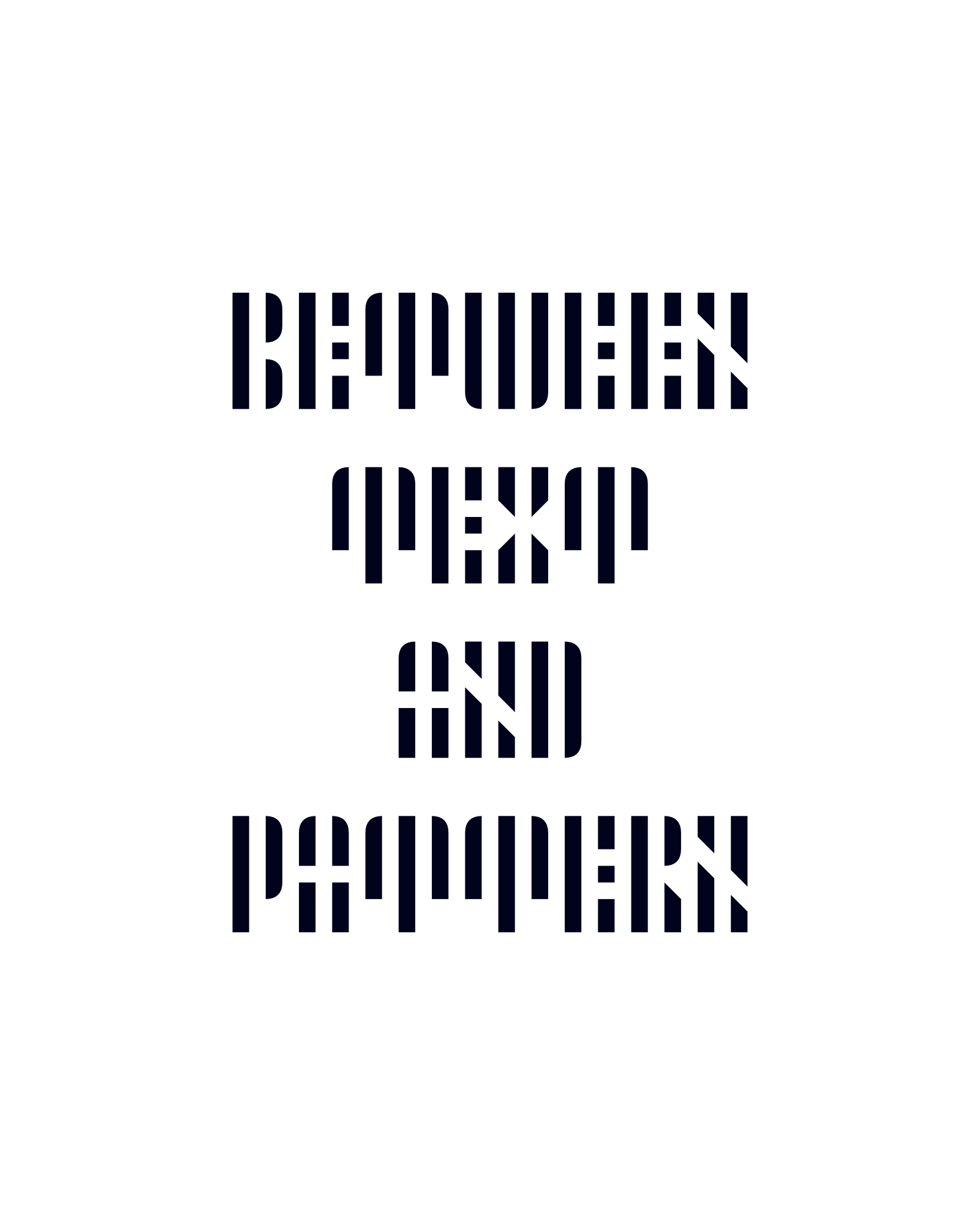
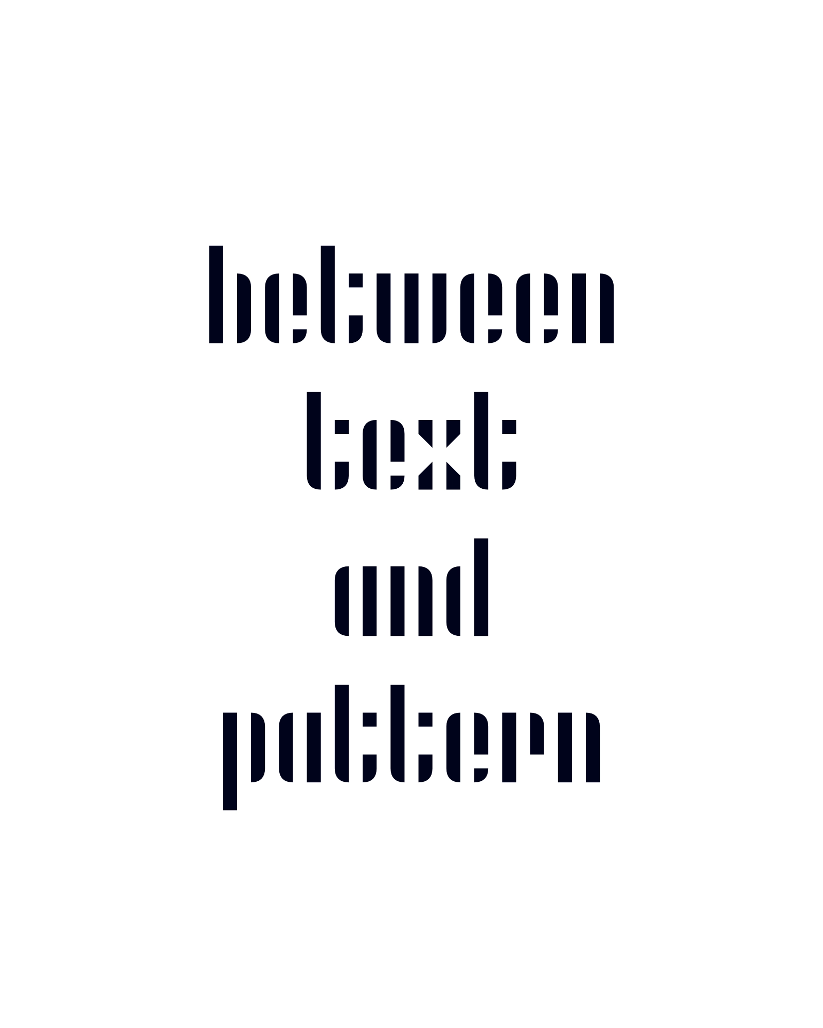
Between text and pattern
In use
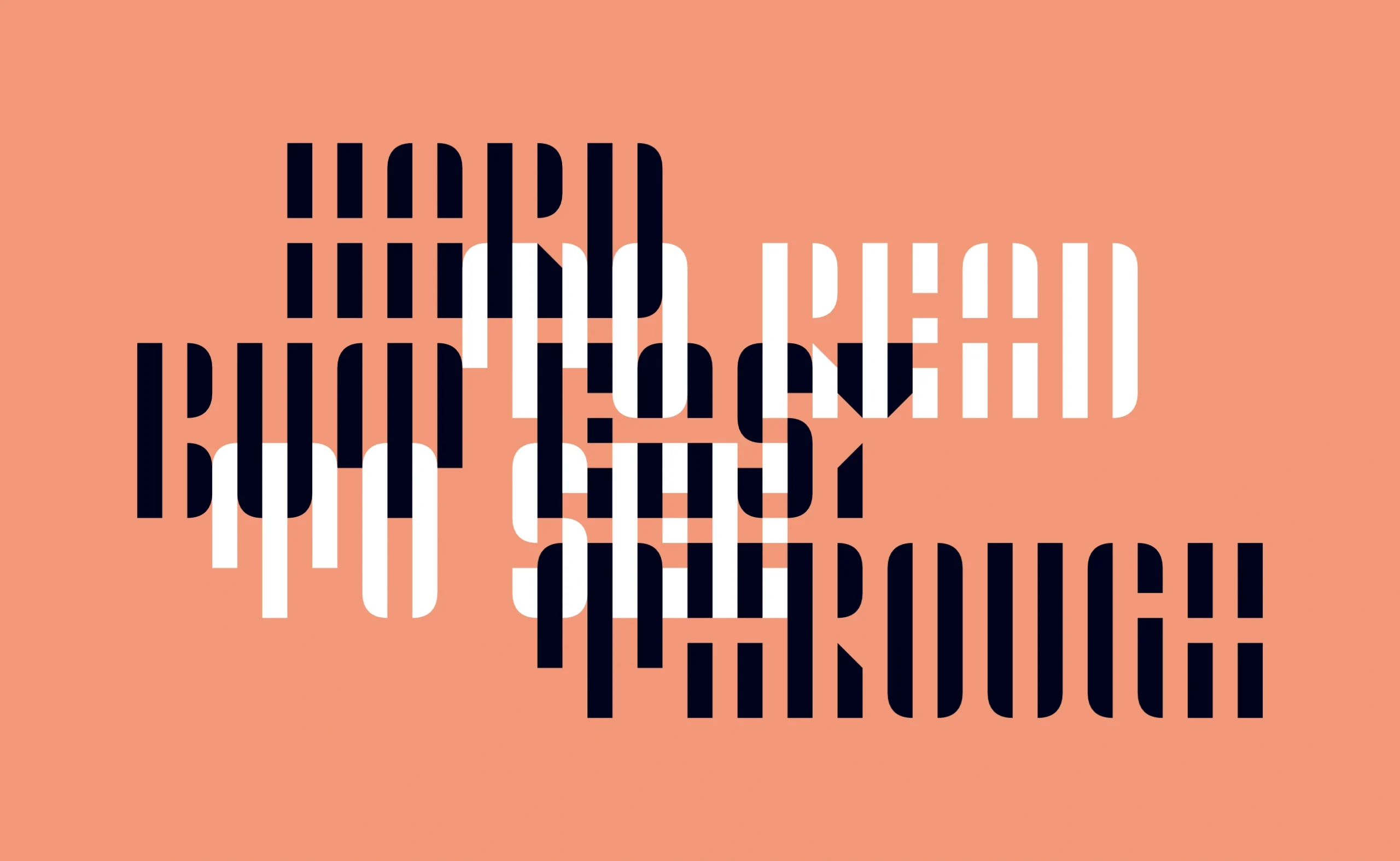
Hard to read but easy to see through
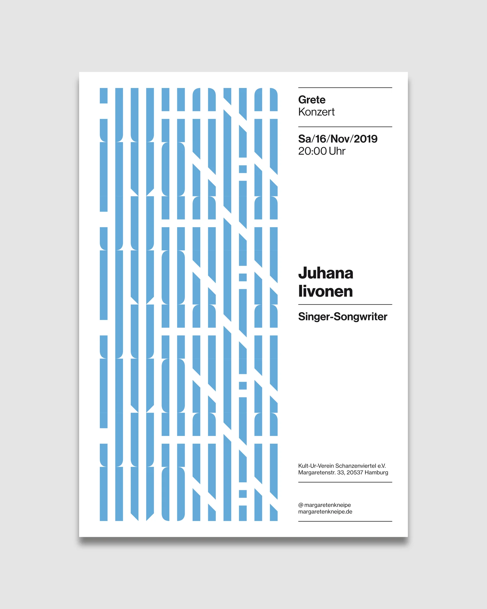
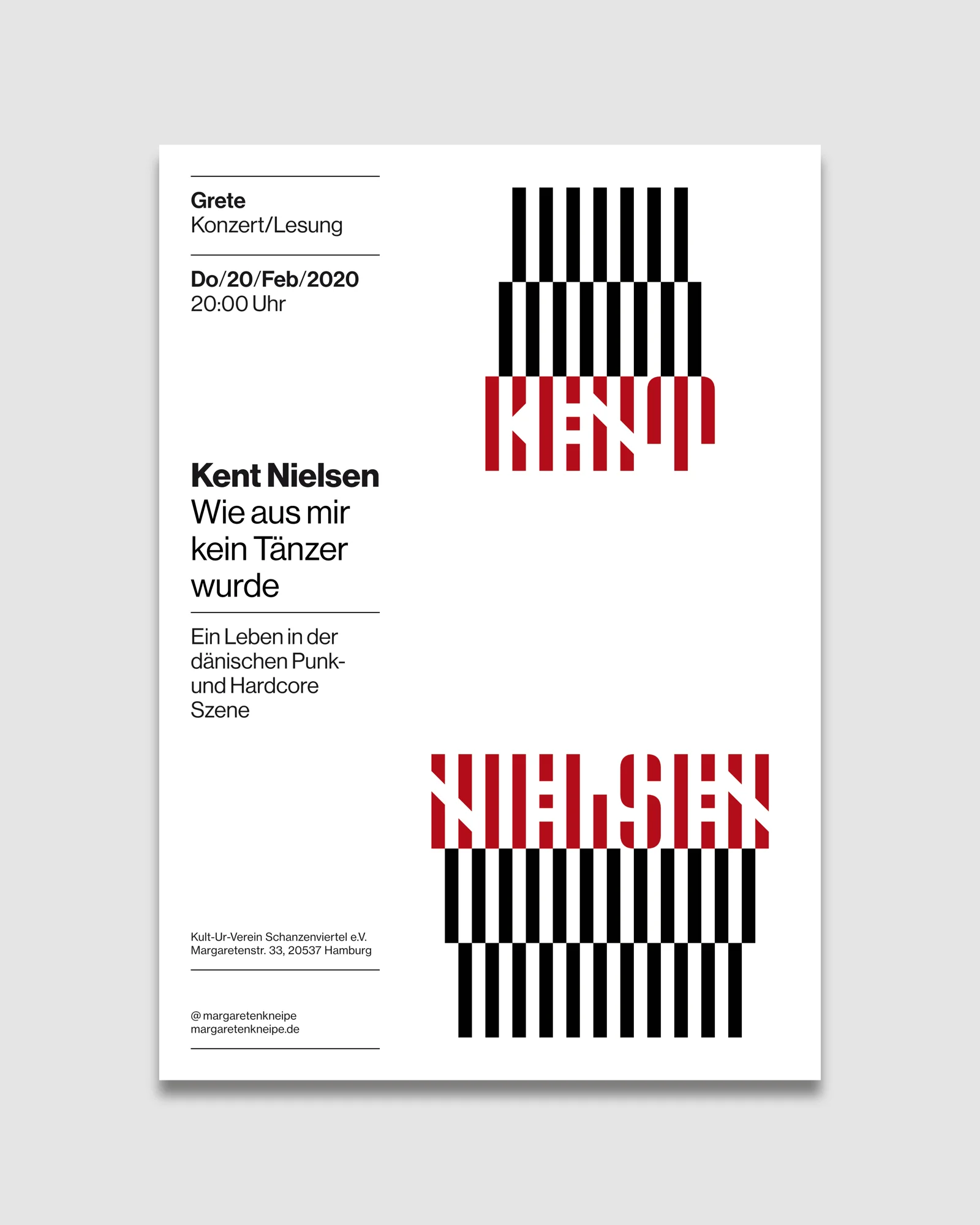
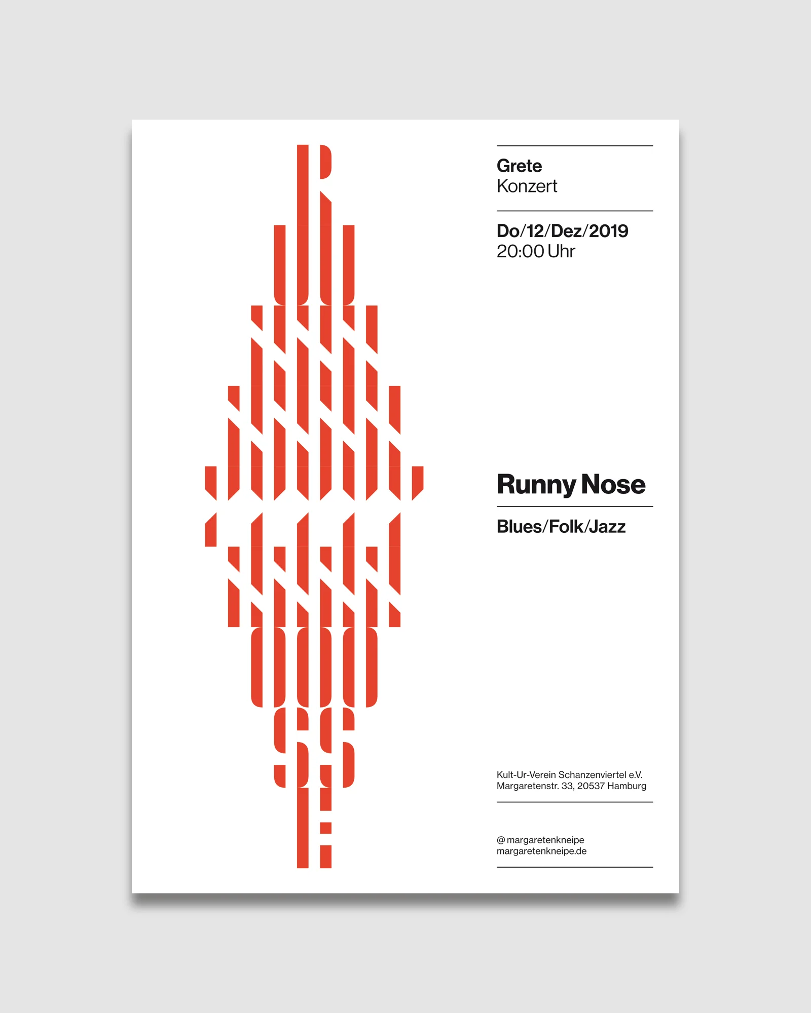
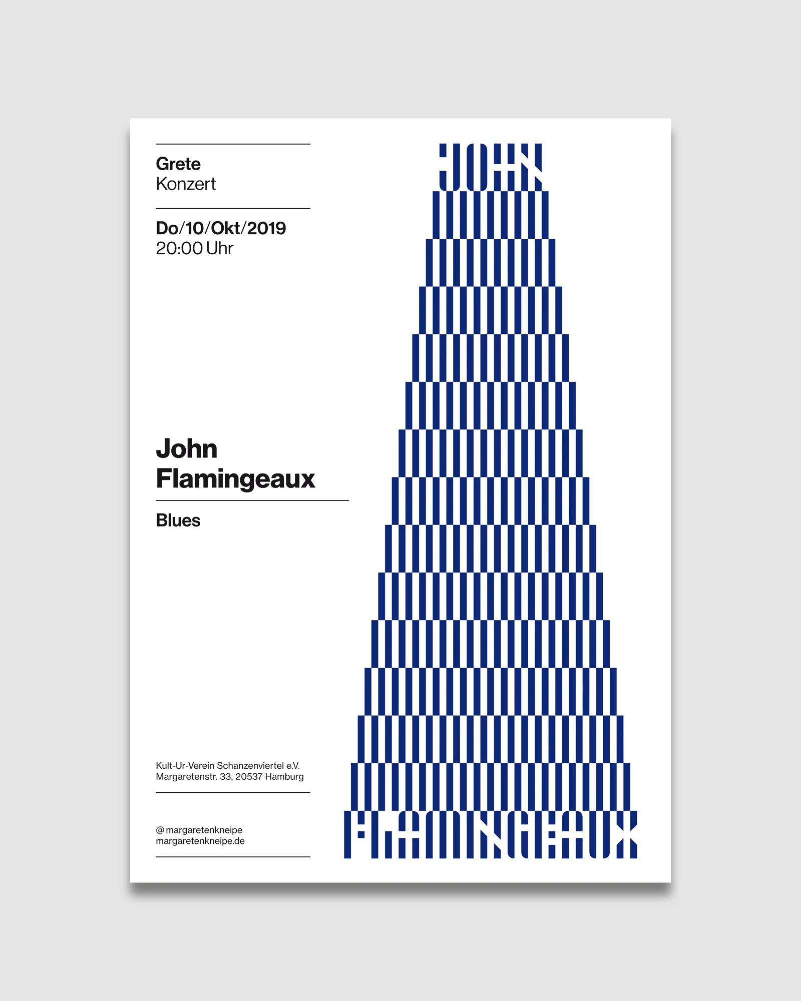
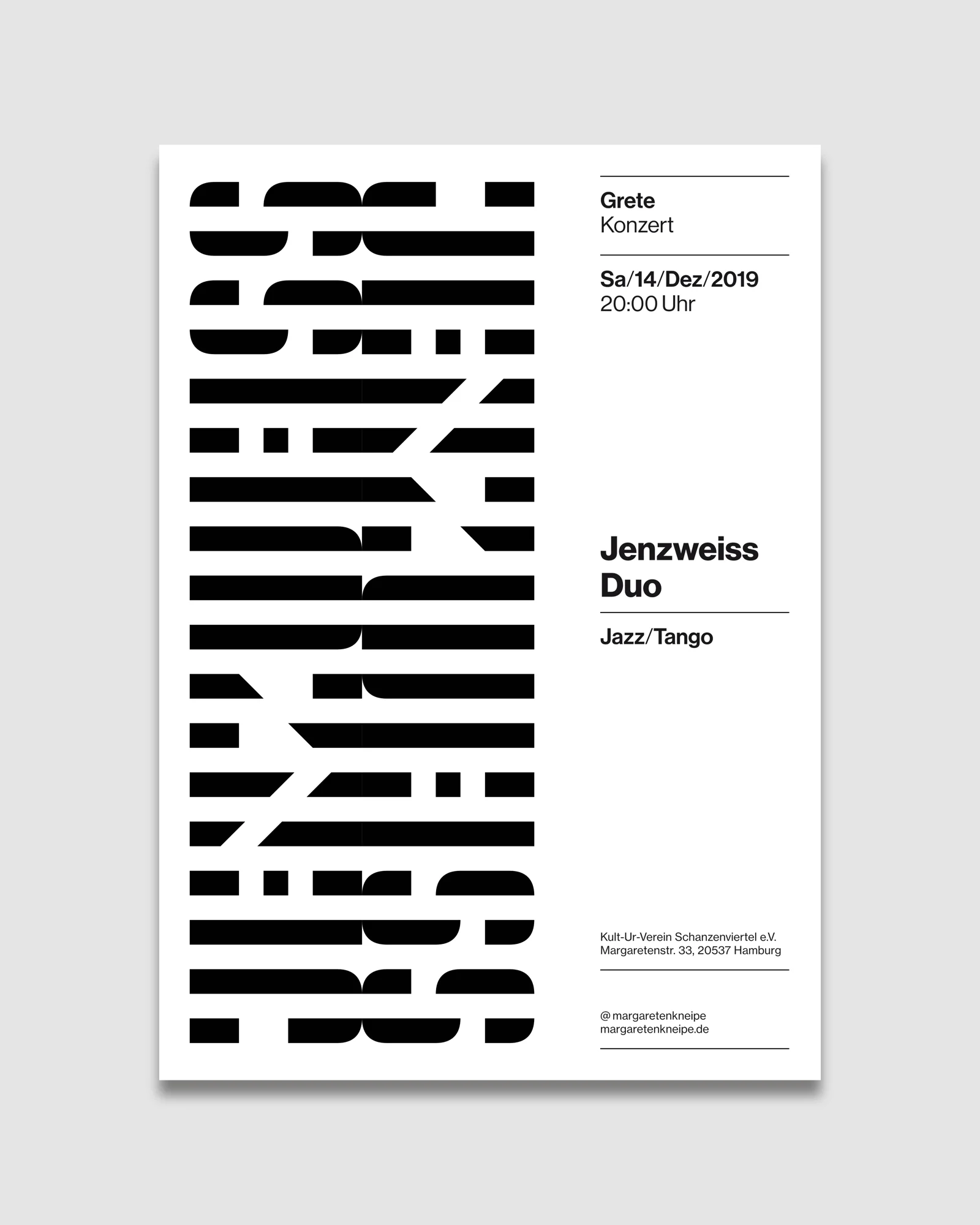
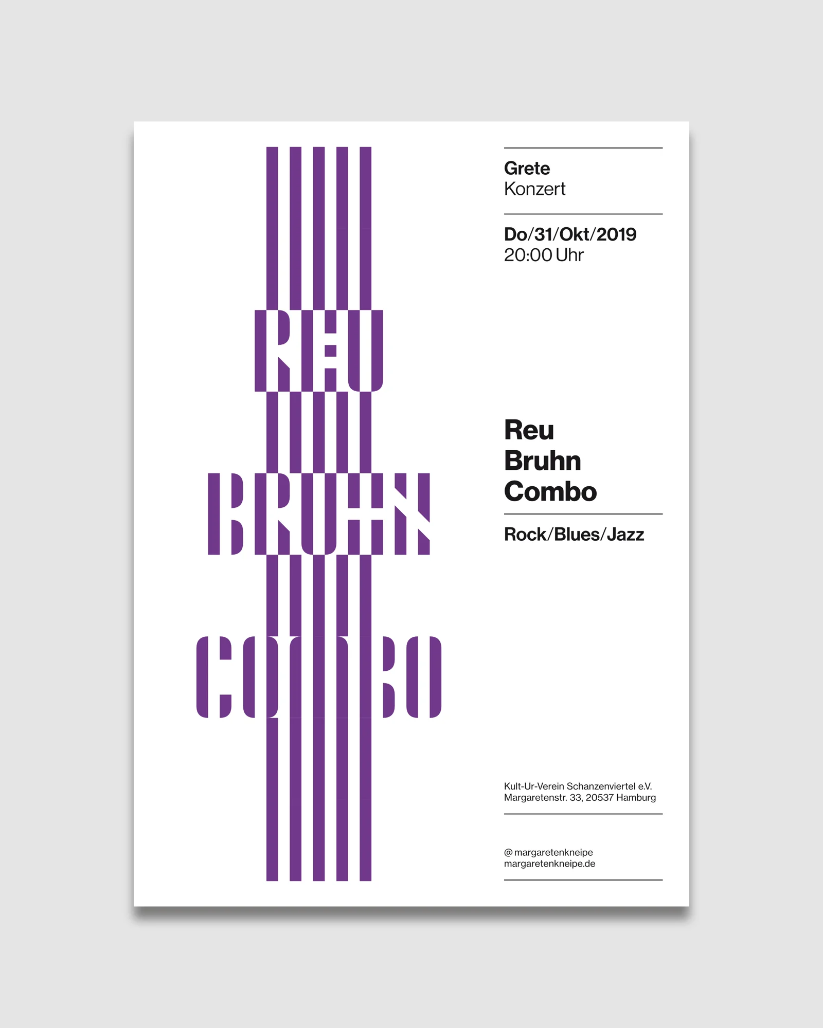
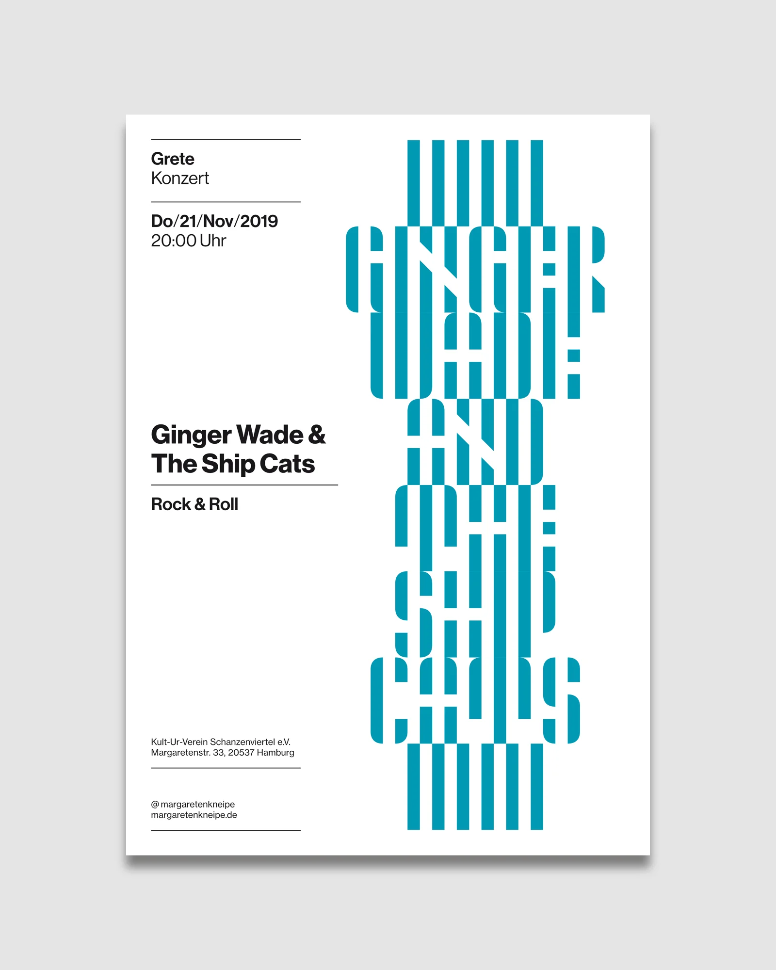
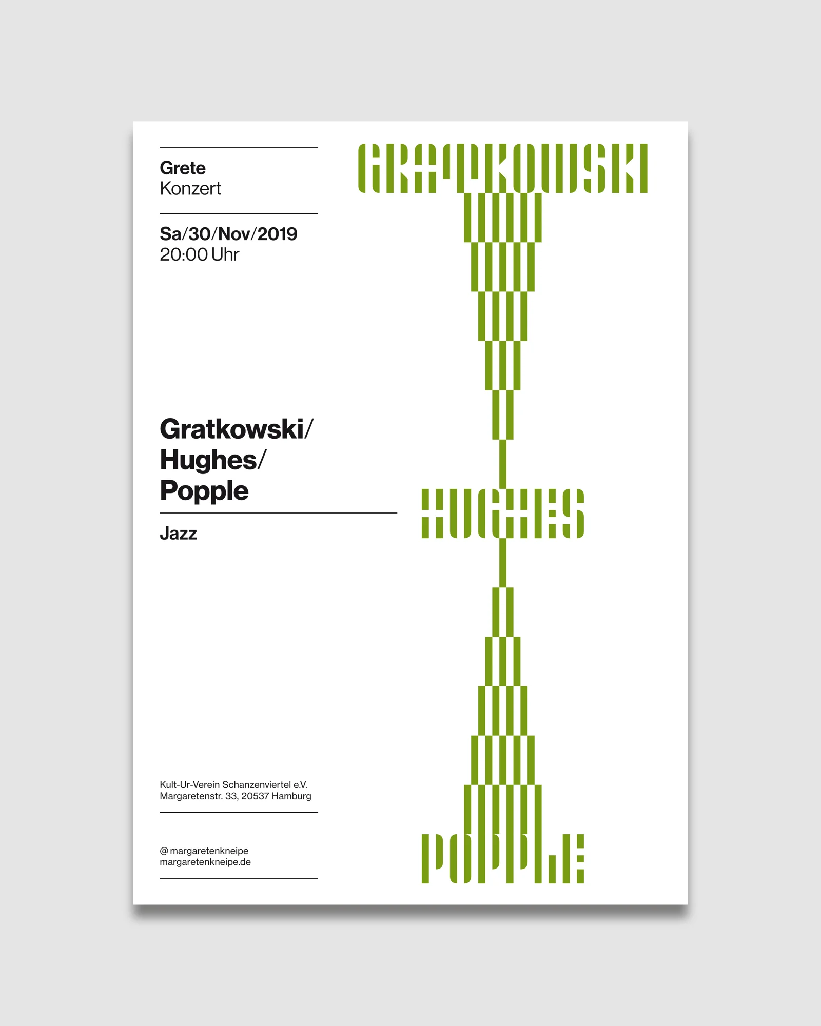
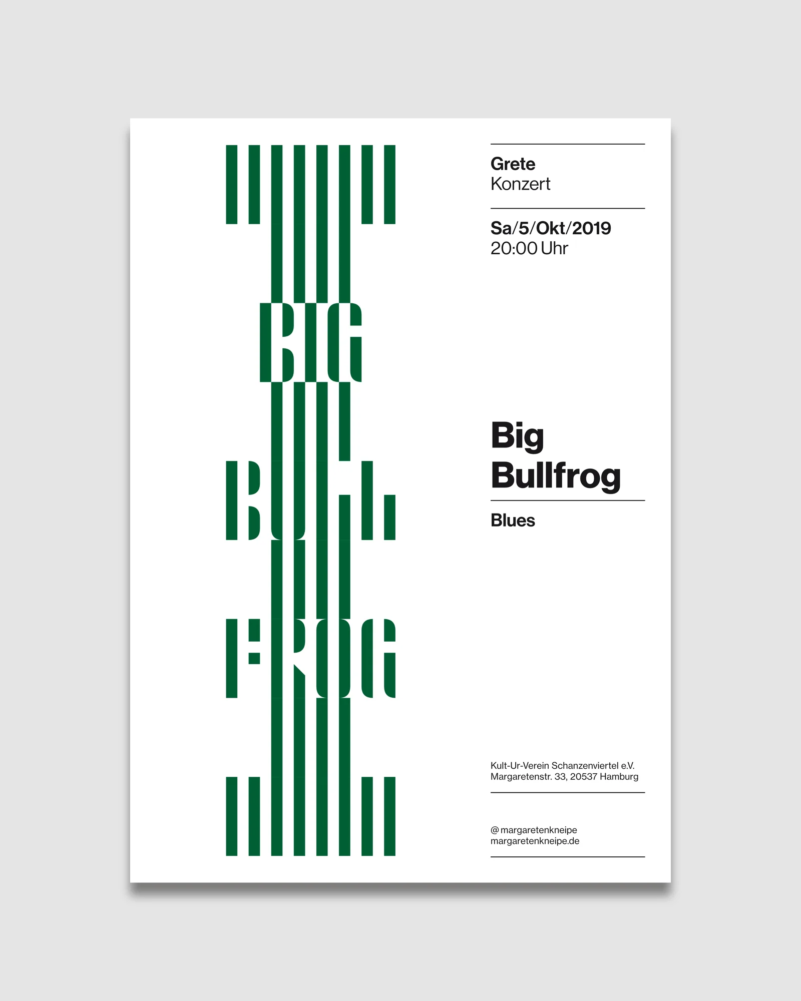
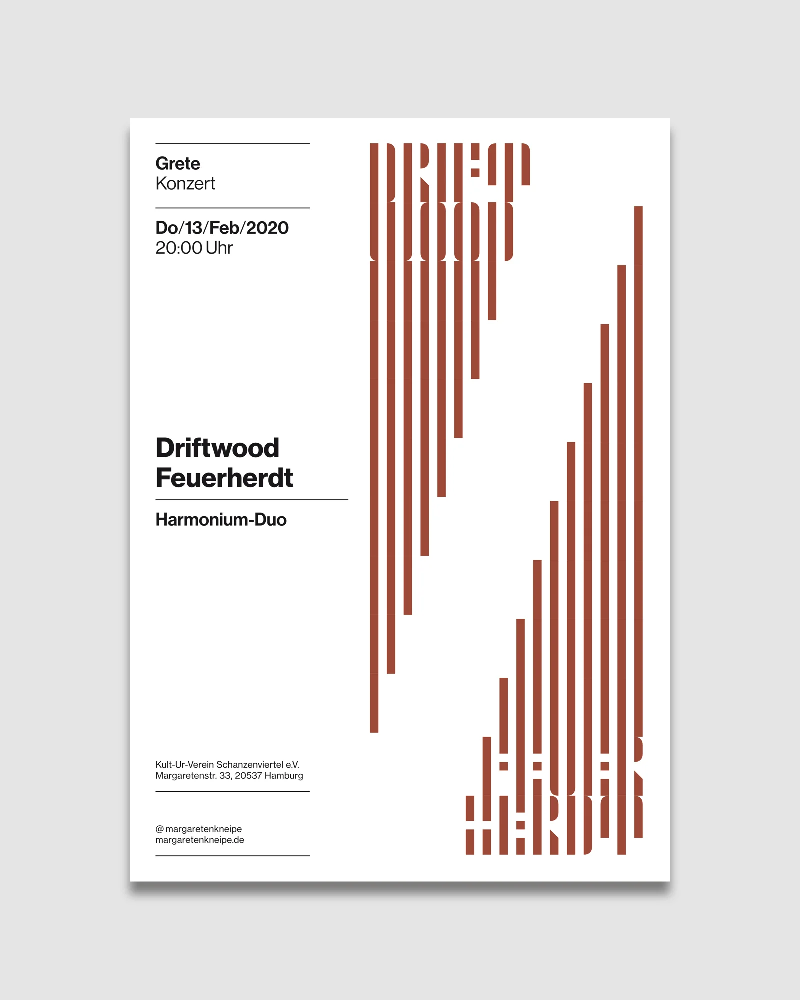
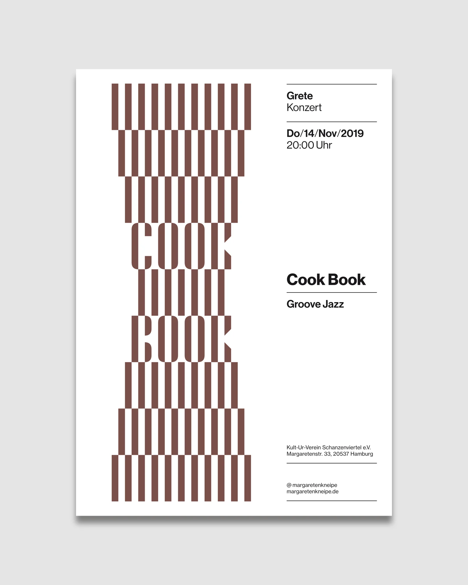
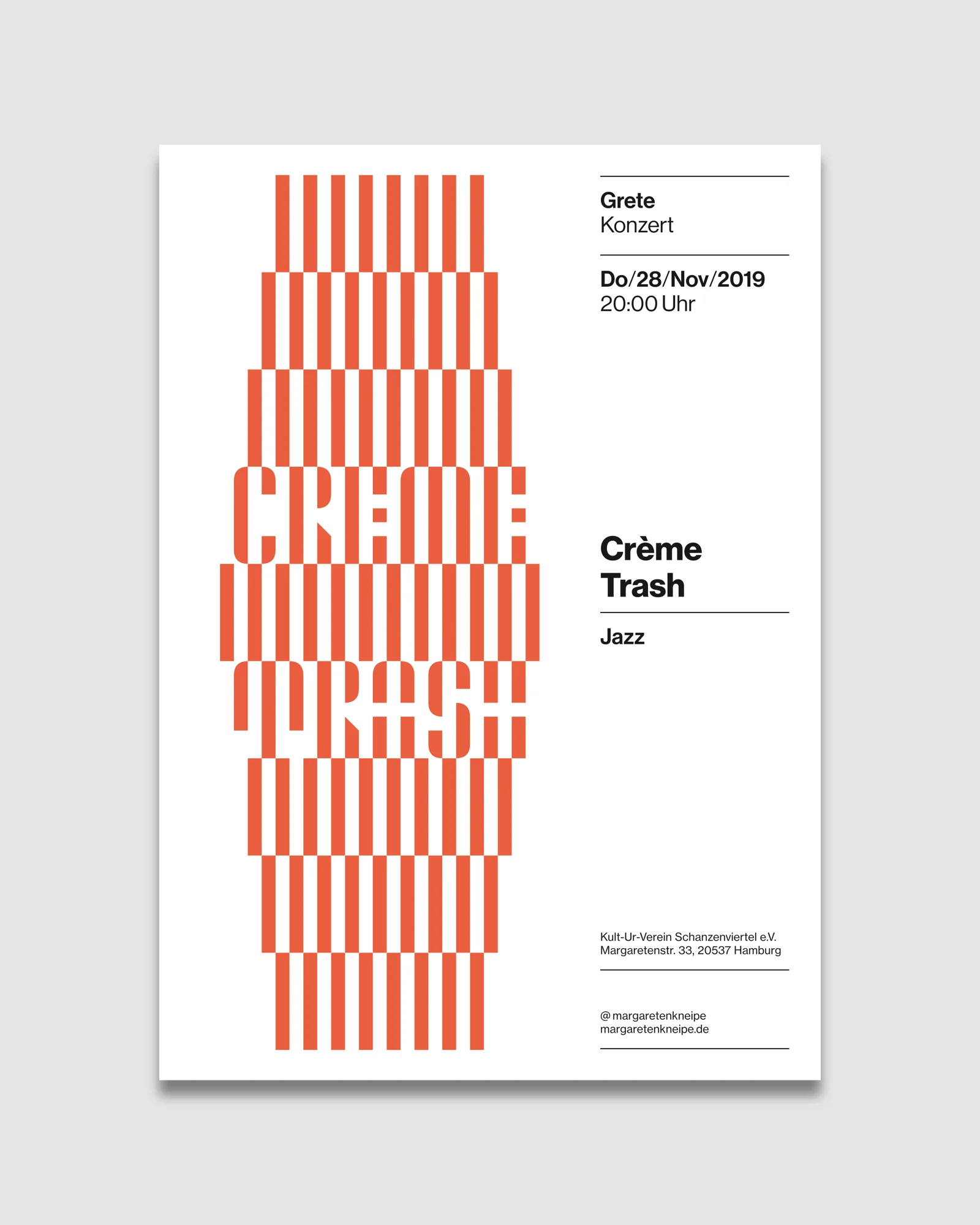
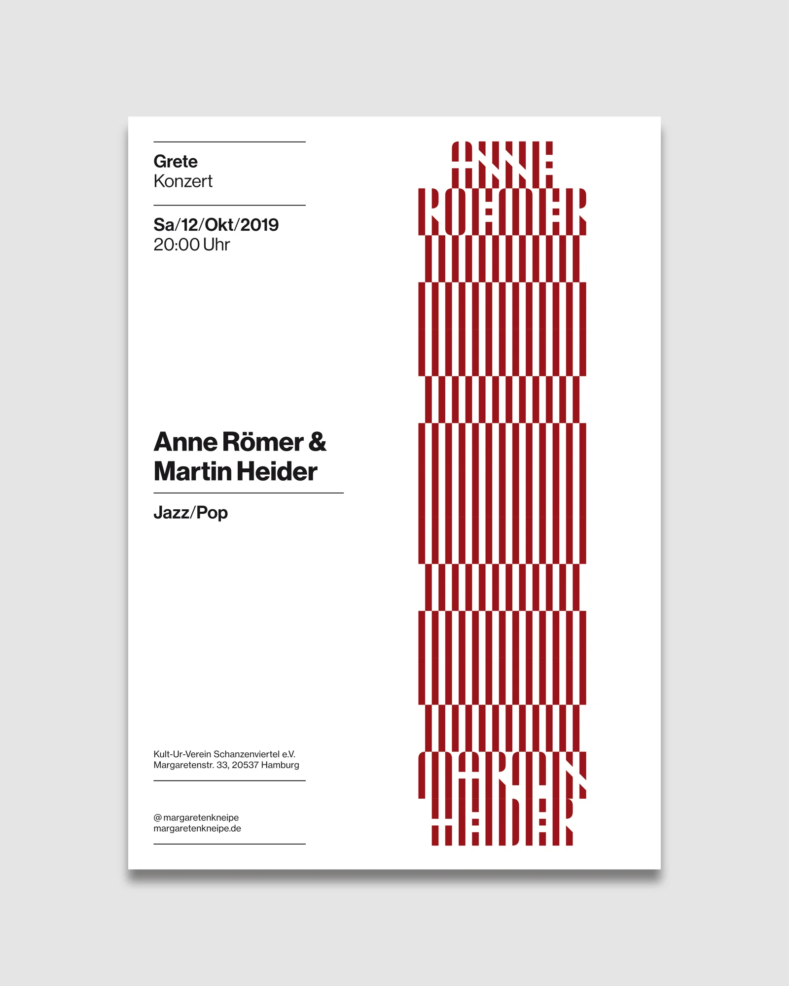
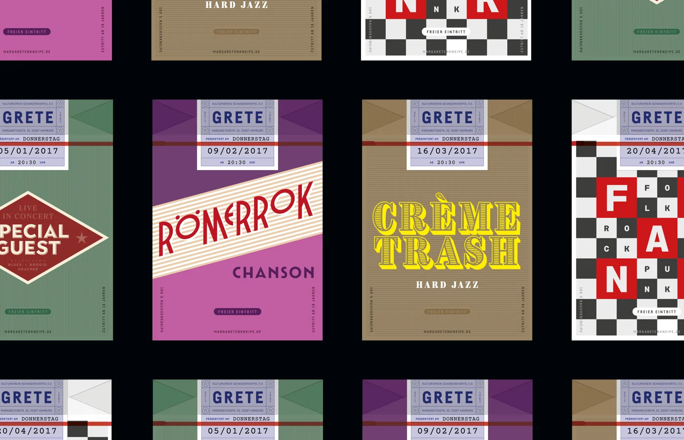
Concert posters
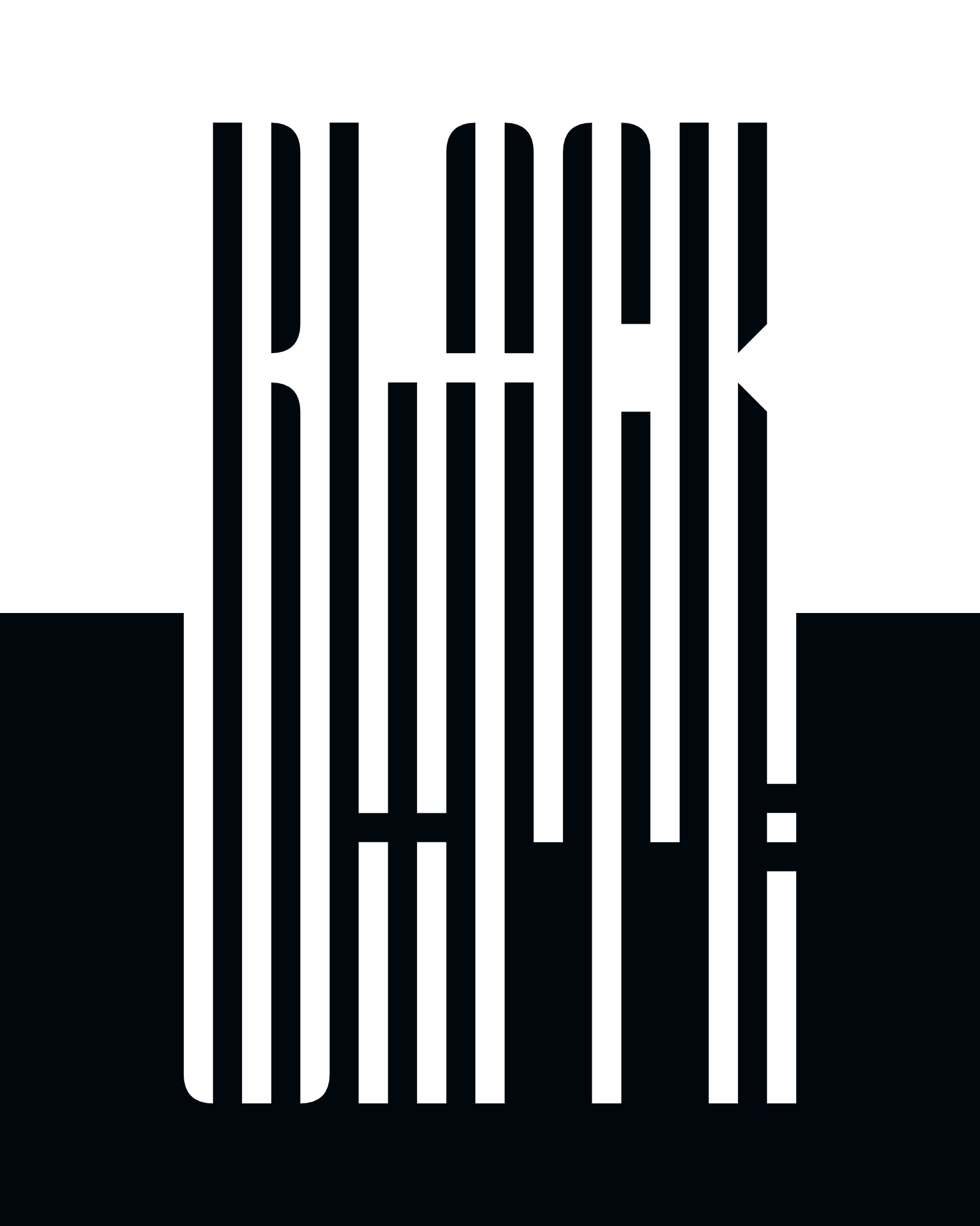
Black – White
Something in here sparked an idea?
Let‘s start with a conversation.
Explore more projects