Casita Oaxaca Food Truck © René Kuntz
Casita Oaxaca
Brand identity for a Hamburg-based Mexican food truck and catering business operating throughout Germany.
The identity pays tribute to the visual heritage of Oaxaca's pre-Columbian cultures, avoiding generic Mexican references. Deity figures and geometric friezes, redrawn in a bold flat graphic language, form the foundation of a system that carries across a vehicle wrap, a packaged product range, printed materials, and stationery.
At its centre is a logo developed from the combination of the geometry of a vehicle tyre and the patterns found in traditional Oaxacan textiles.
Services
Art Direction
Brand Identity
Packaging Design
Editorial Design
Illustration

The truck wrap represents the most visible application of the identity. Large-scale deity figures and a geometric frieze are applied across the turquoise Fiat Ducato, creating a recognisable presence at markets, festivals, and events throughout Germany.

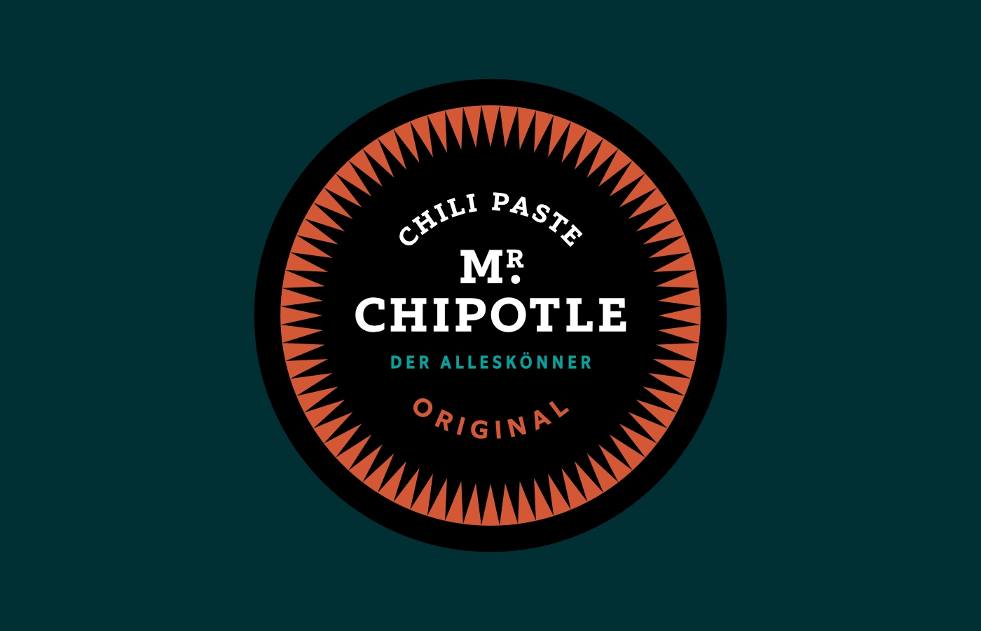
For the salsa and mole range, a packaging system was developed around a single organising principle. A horizontal colour band identifies each variety while a consistent typographic hierarchy structures all product information. The system provides clarity across the range and allows for future expansion.

Salsas & Moles

Jar wraparound labels
Printed materials and stationery extend the identity across all operational touchpoints. Promotional flyers, stickers, and menu covers carry the same graphic expression as the truck, while menu sheets are designed for quick navigation and readability. Letterheads and business cards take a strictly typographic, functional approach.

Flyers

Stickers

Event Catering Menu Cover
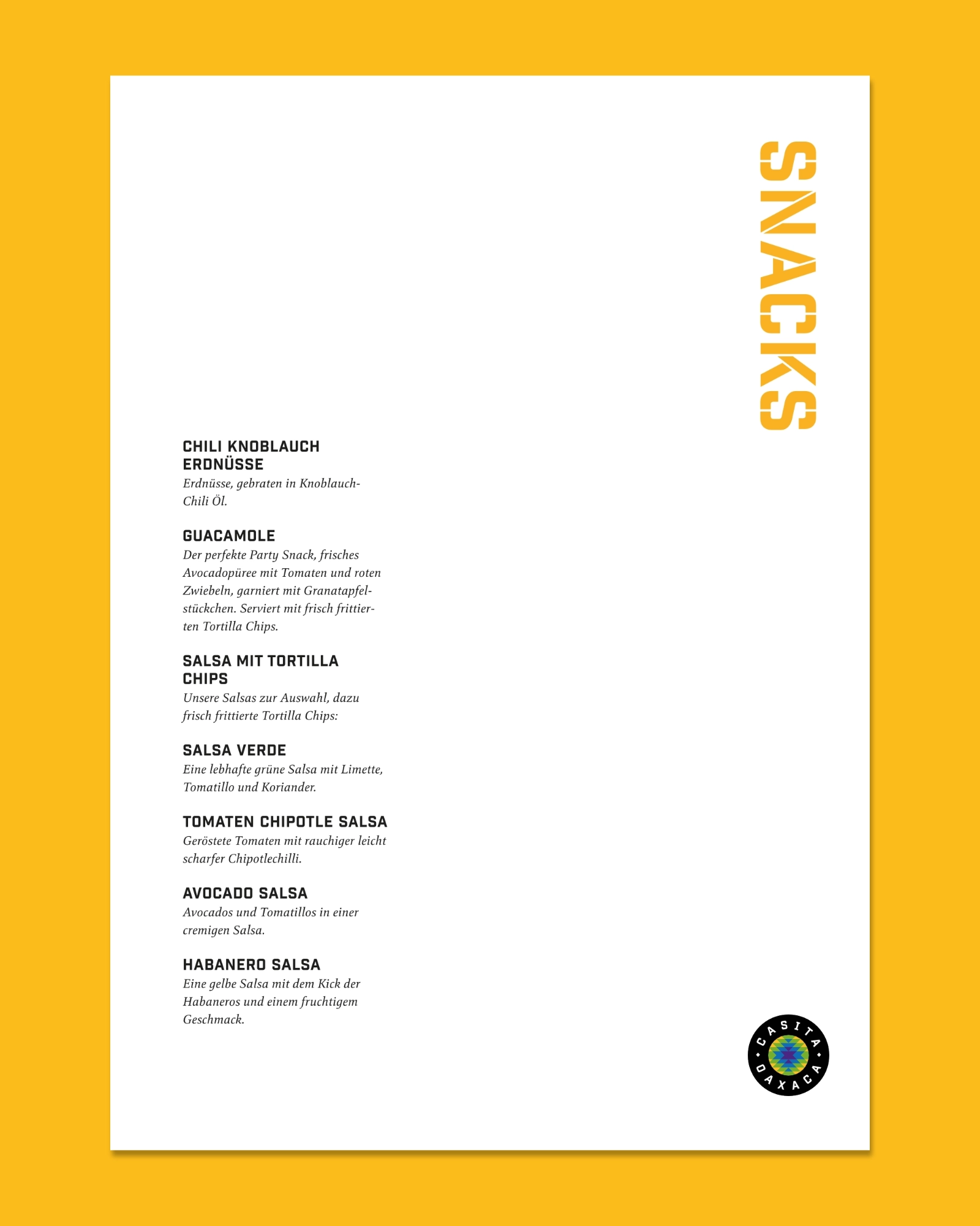
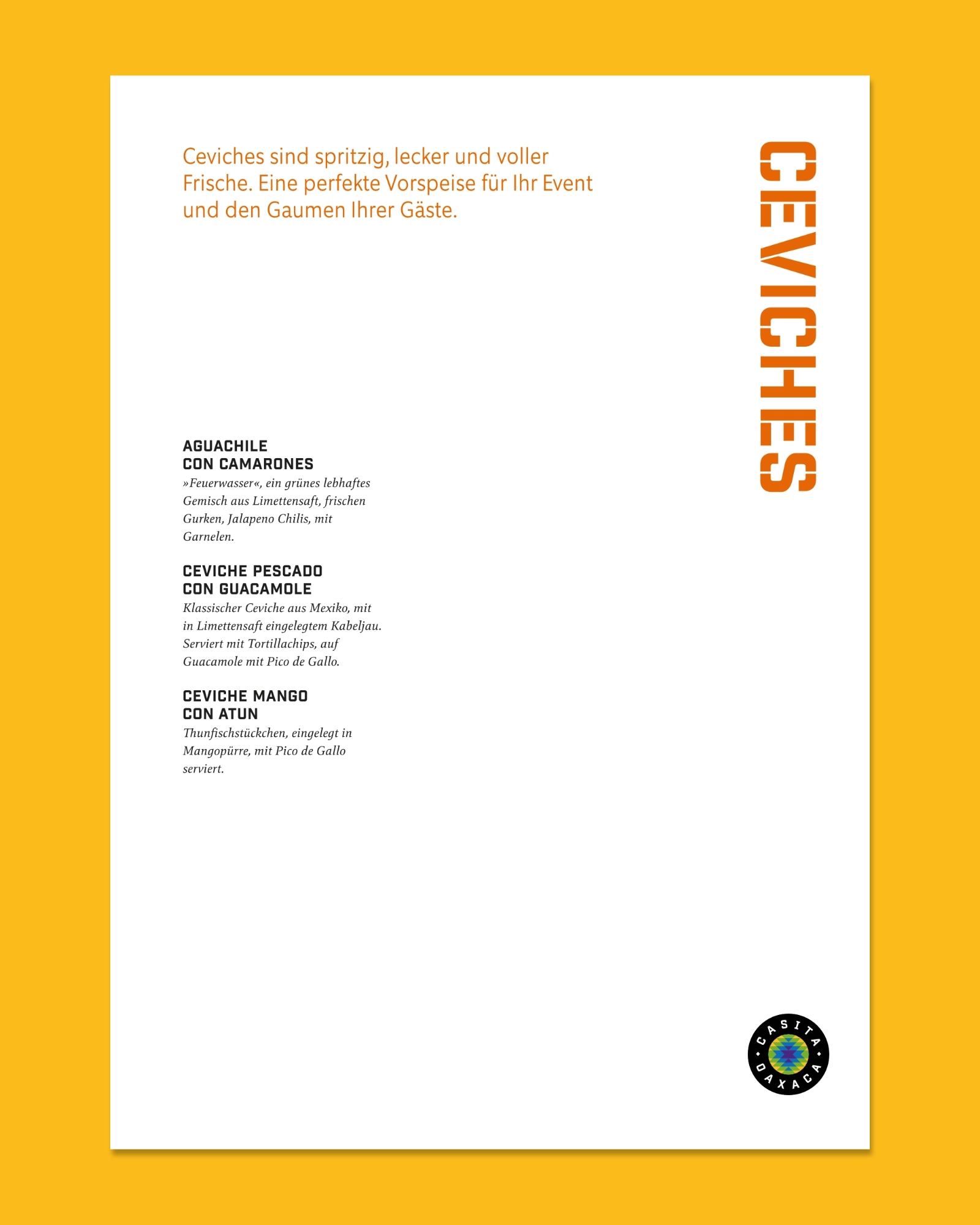
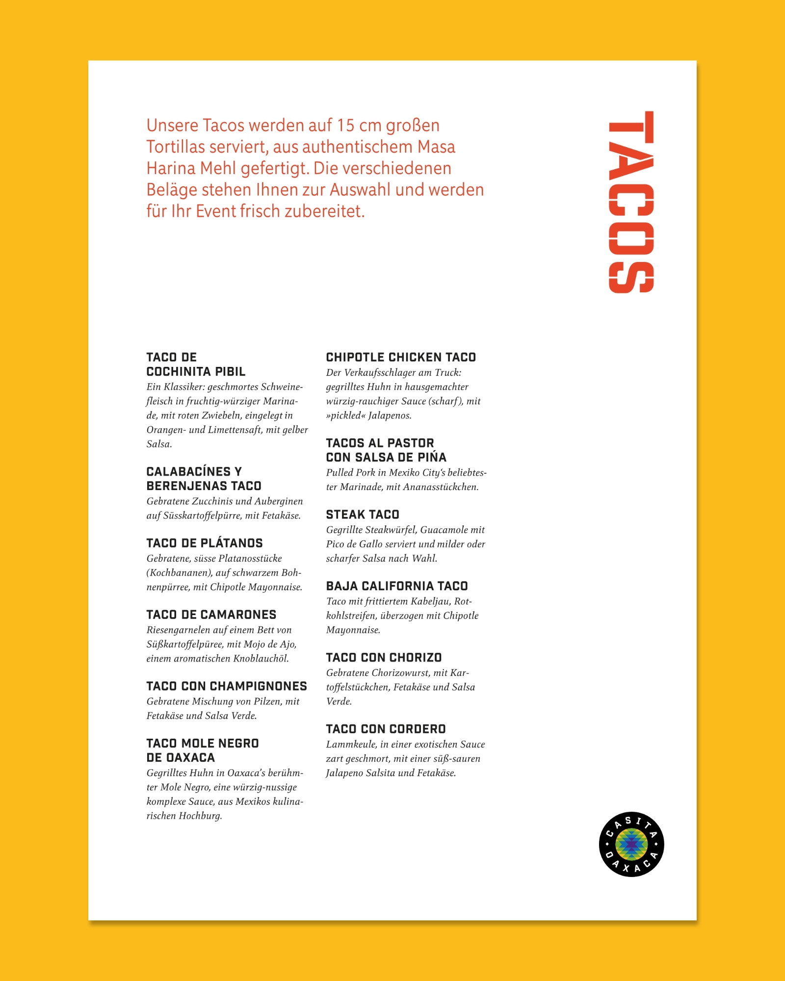
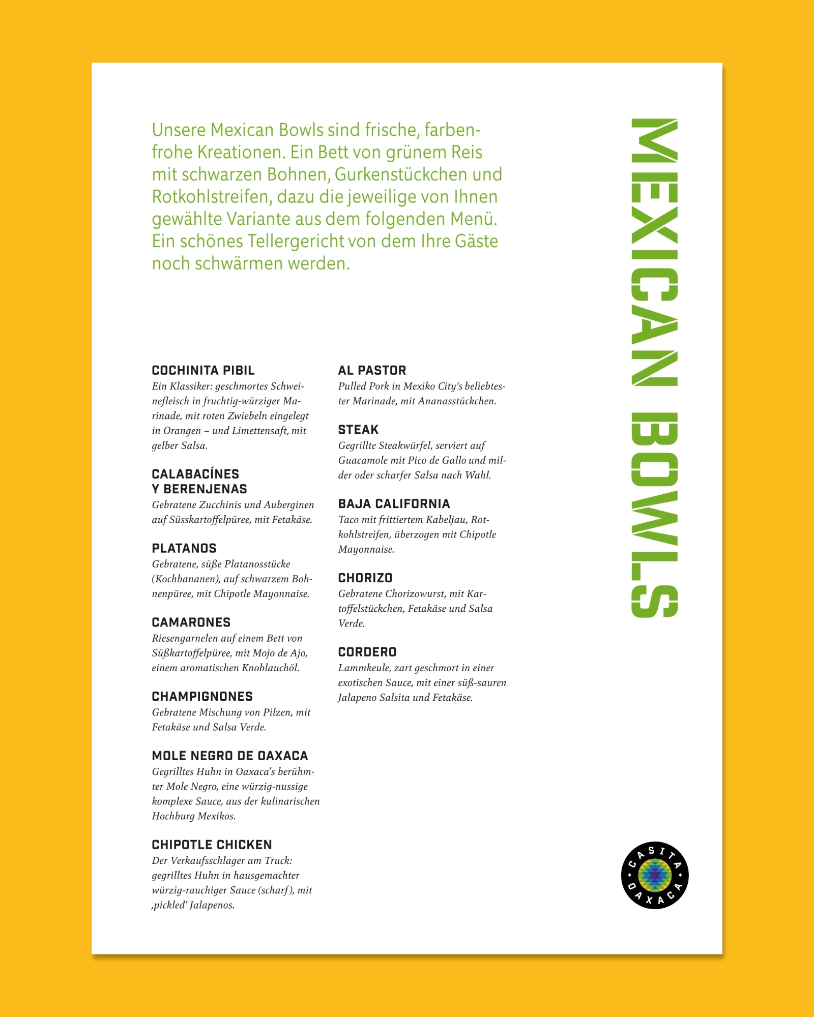
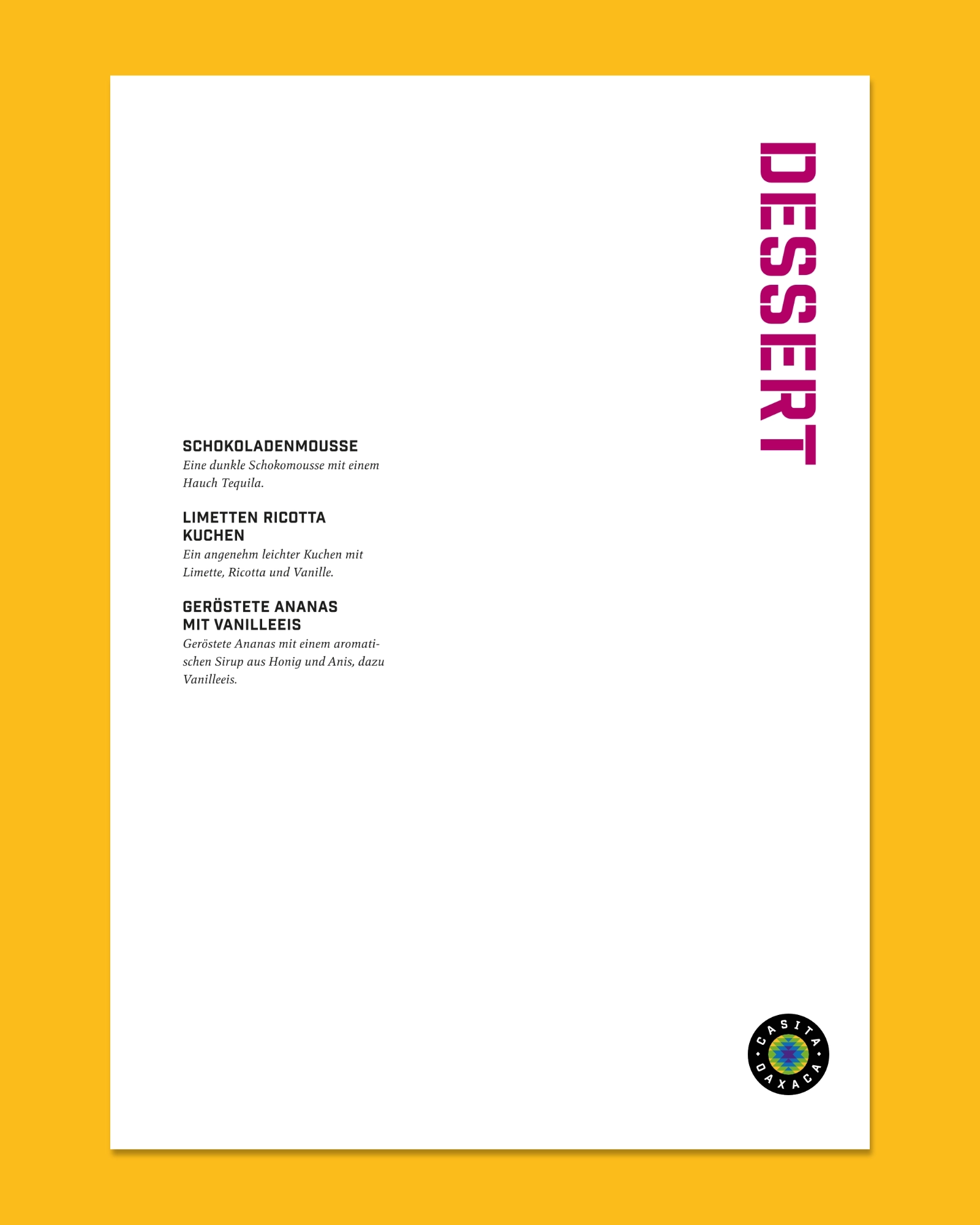
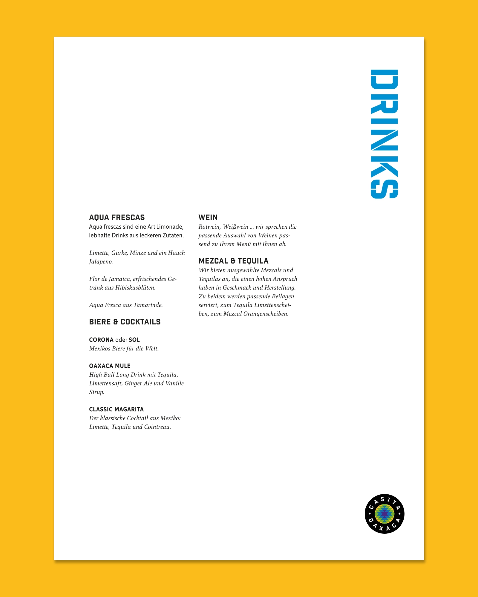
Event Catering Menu Sheets

Street Action Menu

Letterhead & Business Card

Taco Chipotle Chicken © René Kuntz
Something in here sparked an idea?
Let‘s start with a conversation.
Explore more projects