Grete
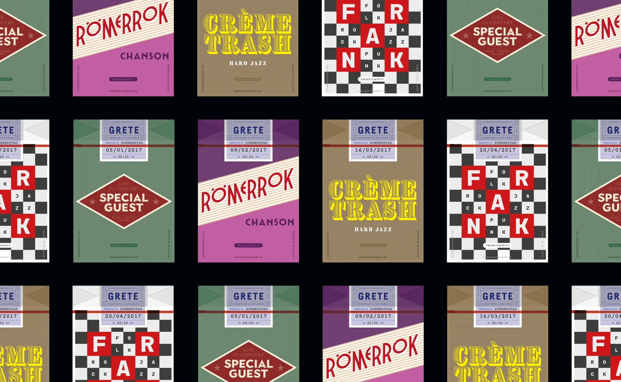
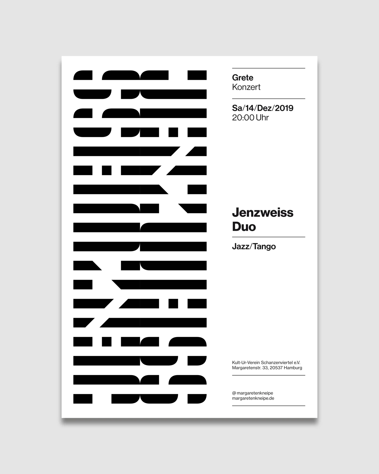
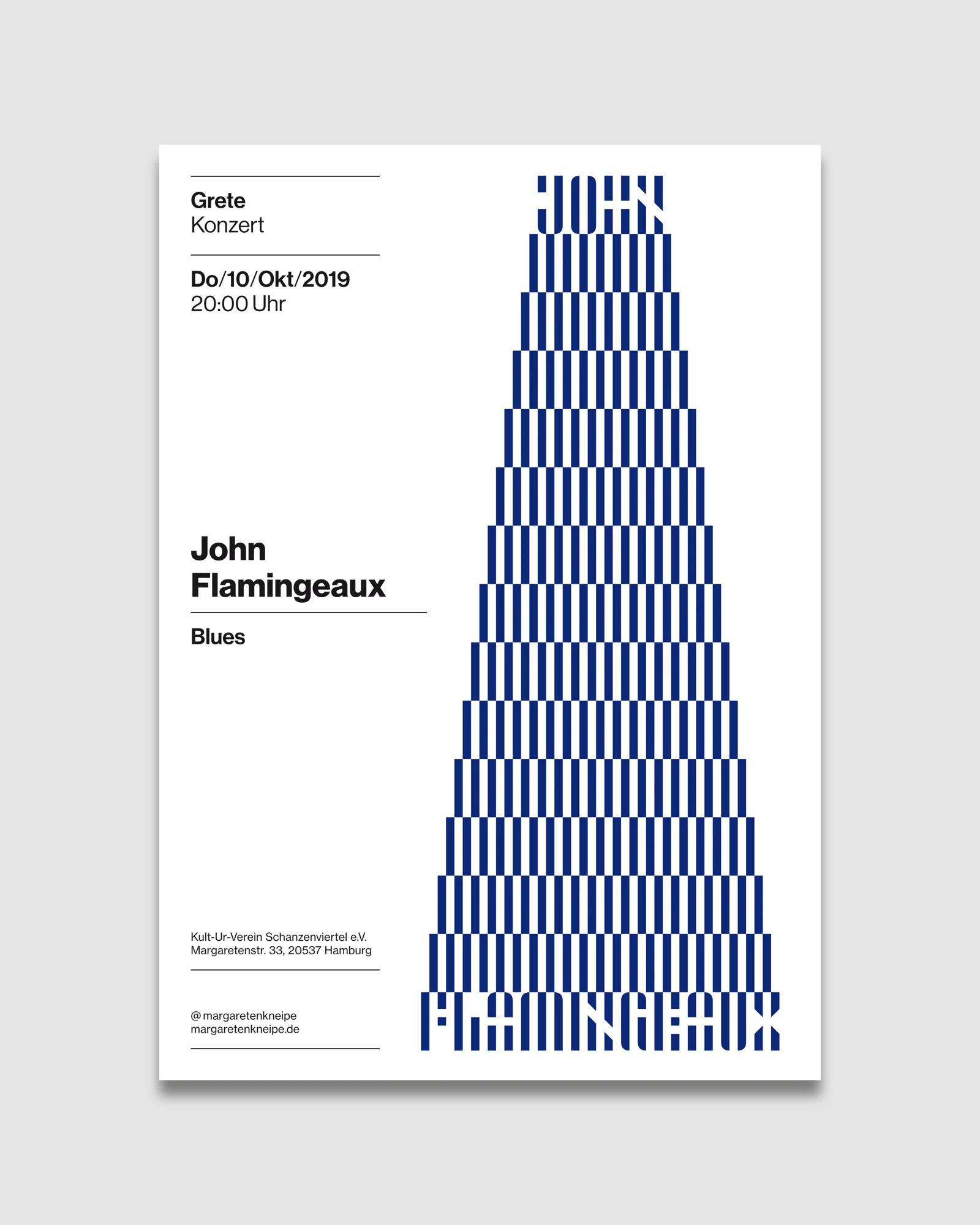
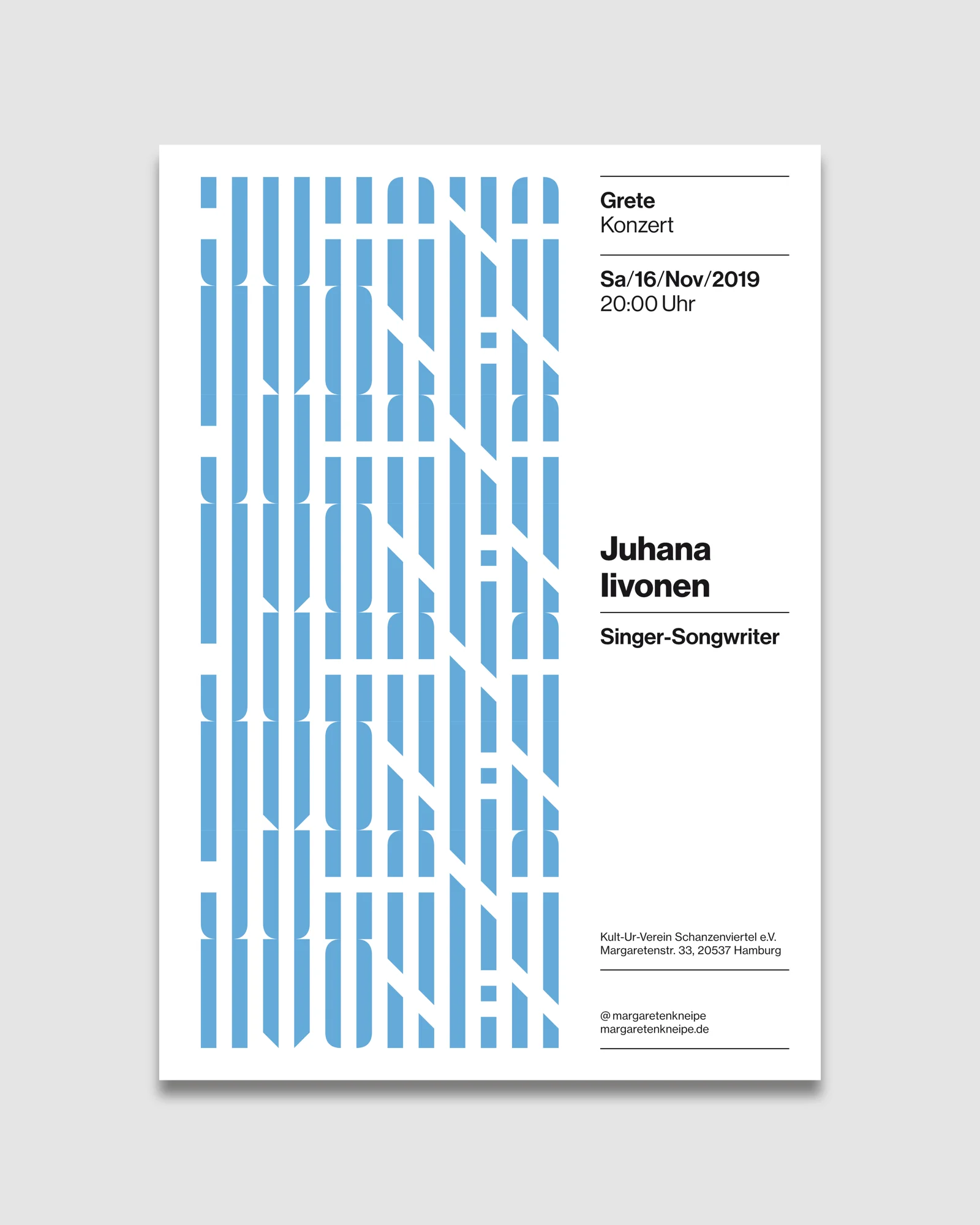
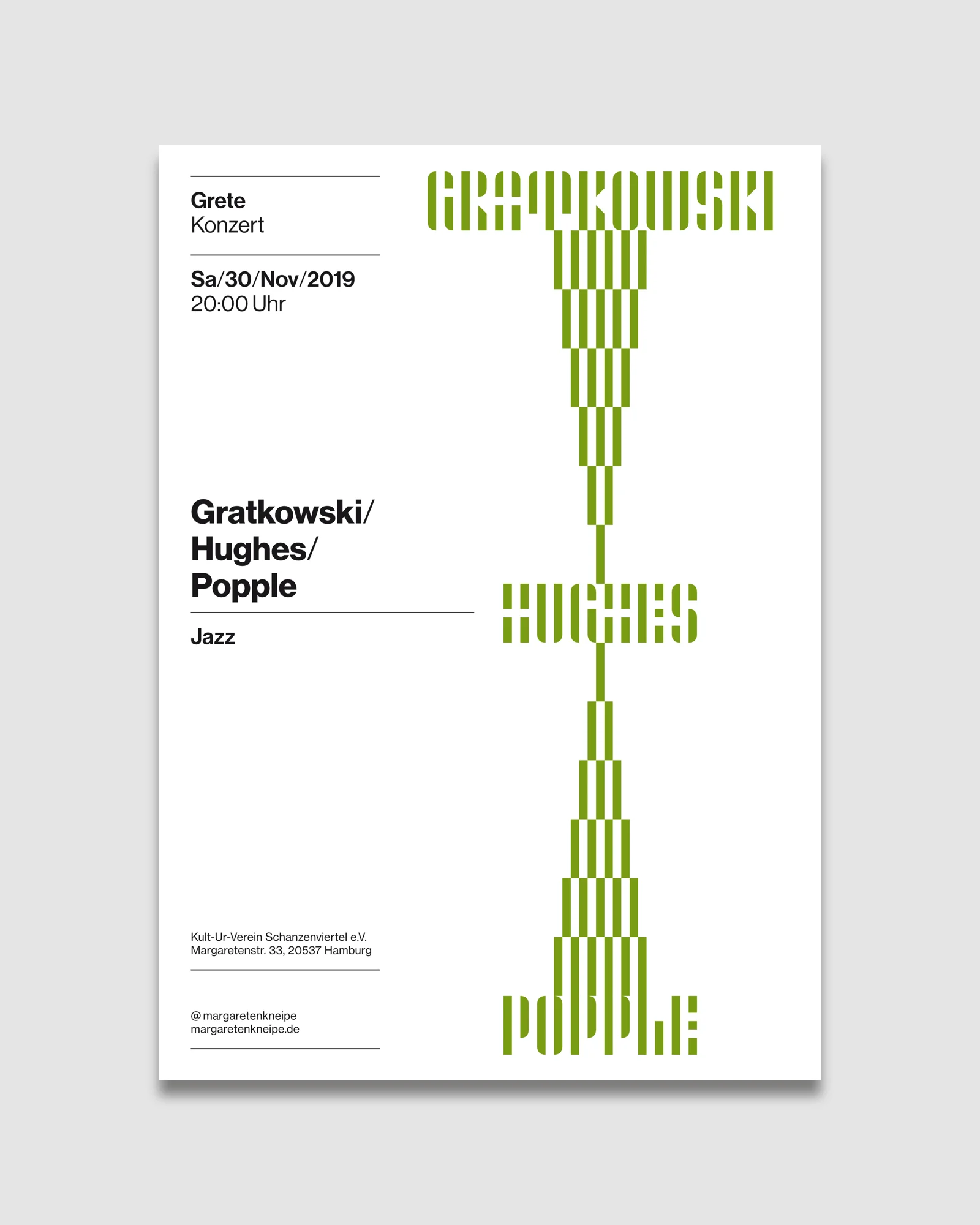
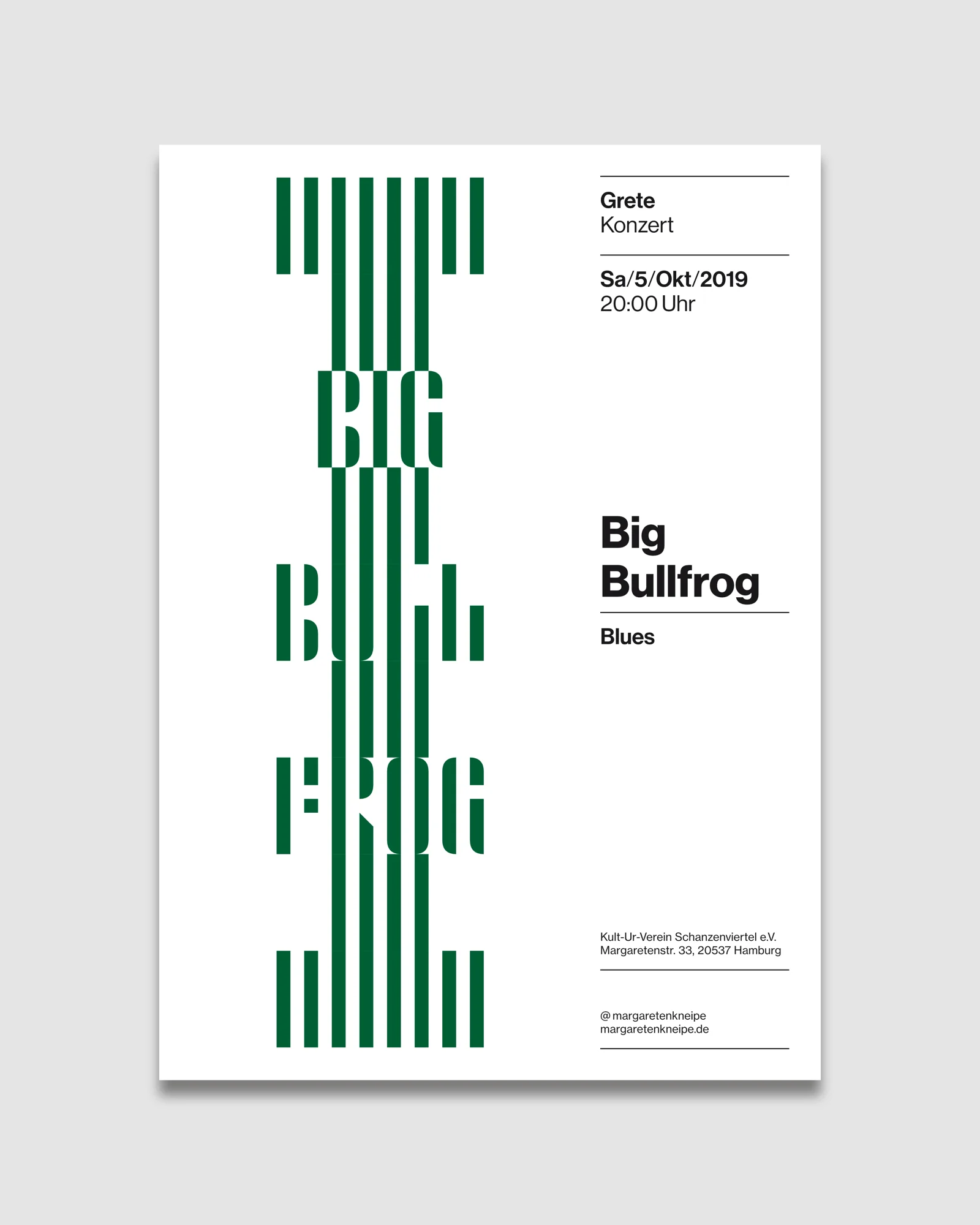
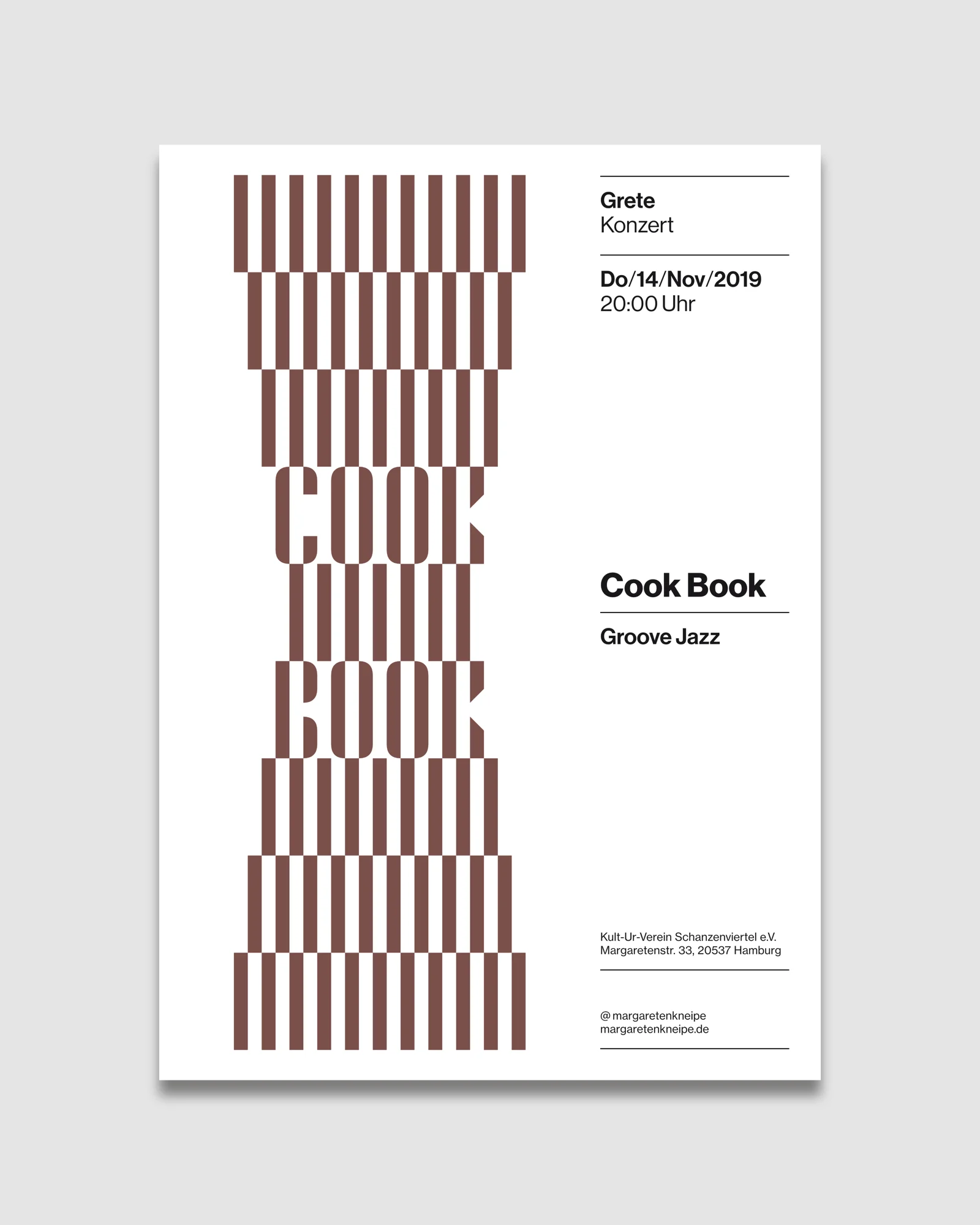
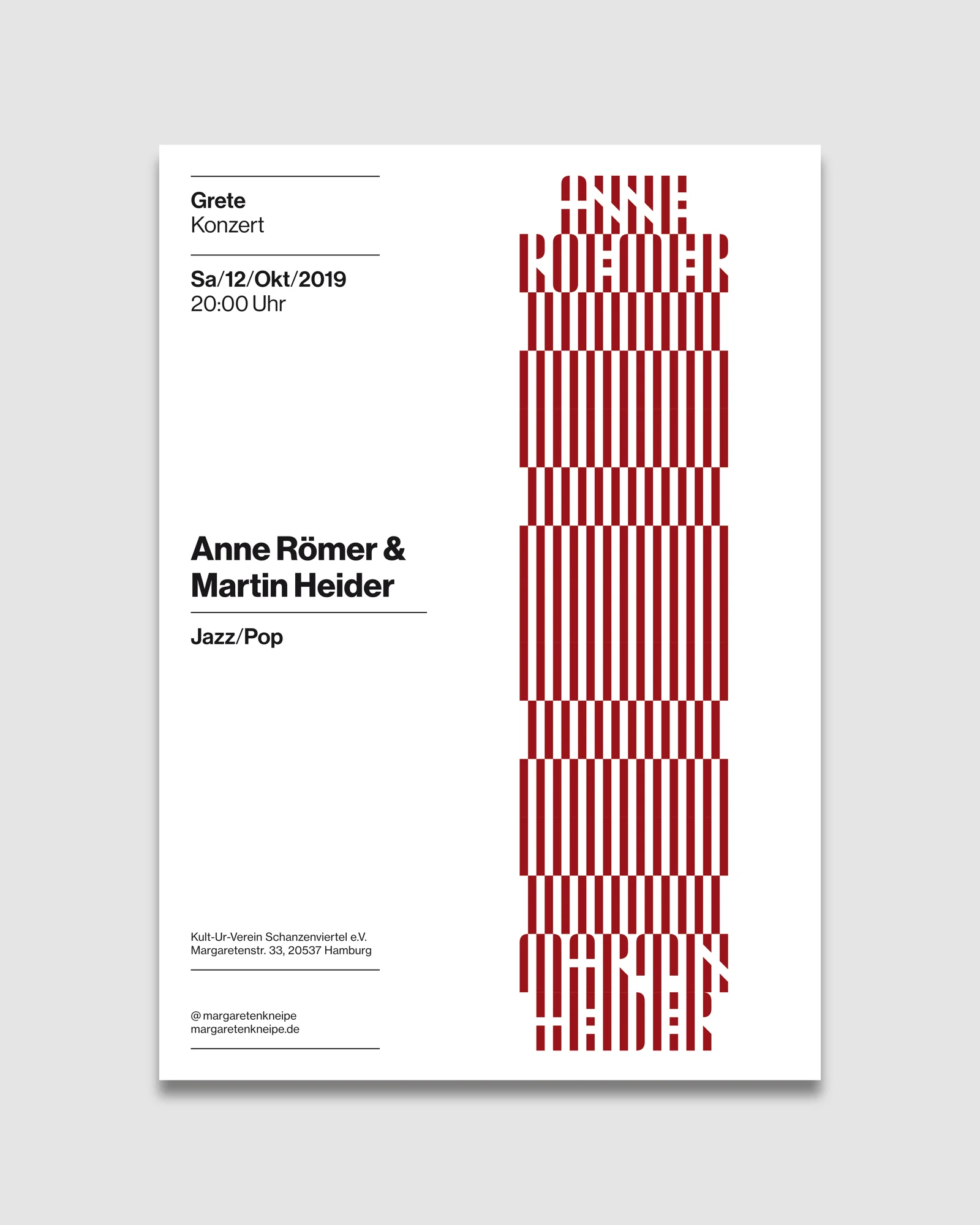
Poster design for a concert series at Grete, a small music venue and smoking bar in Hamburg.
As the lineup often featured emerging, lesser-known musicians, press photos or graphics were rarely available, calling for a visual system that could work independently of external imagery.
Services
Art Direction
Poster Design
Typography
Type Design
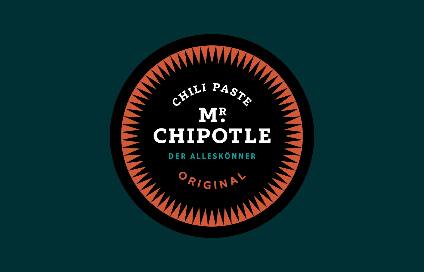
Early posters reinterpreted the artists' names as fictional cigarette brands, referencing the venue's smoke-filled atmosphere.
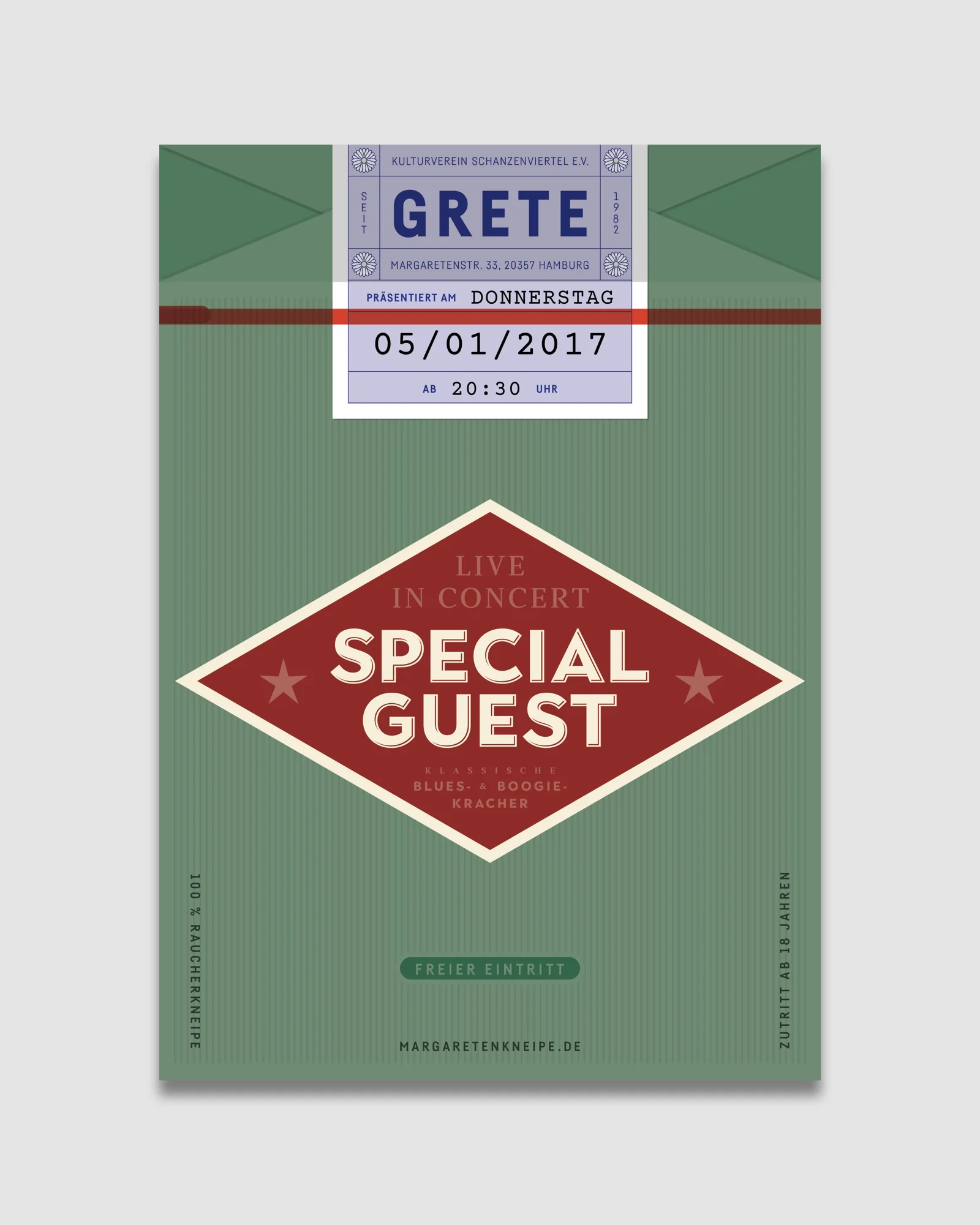
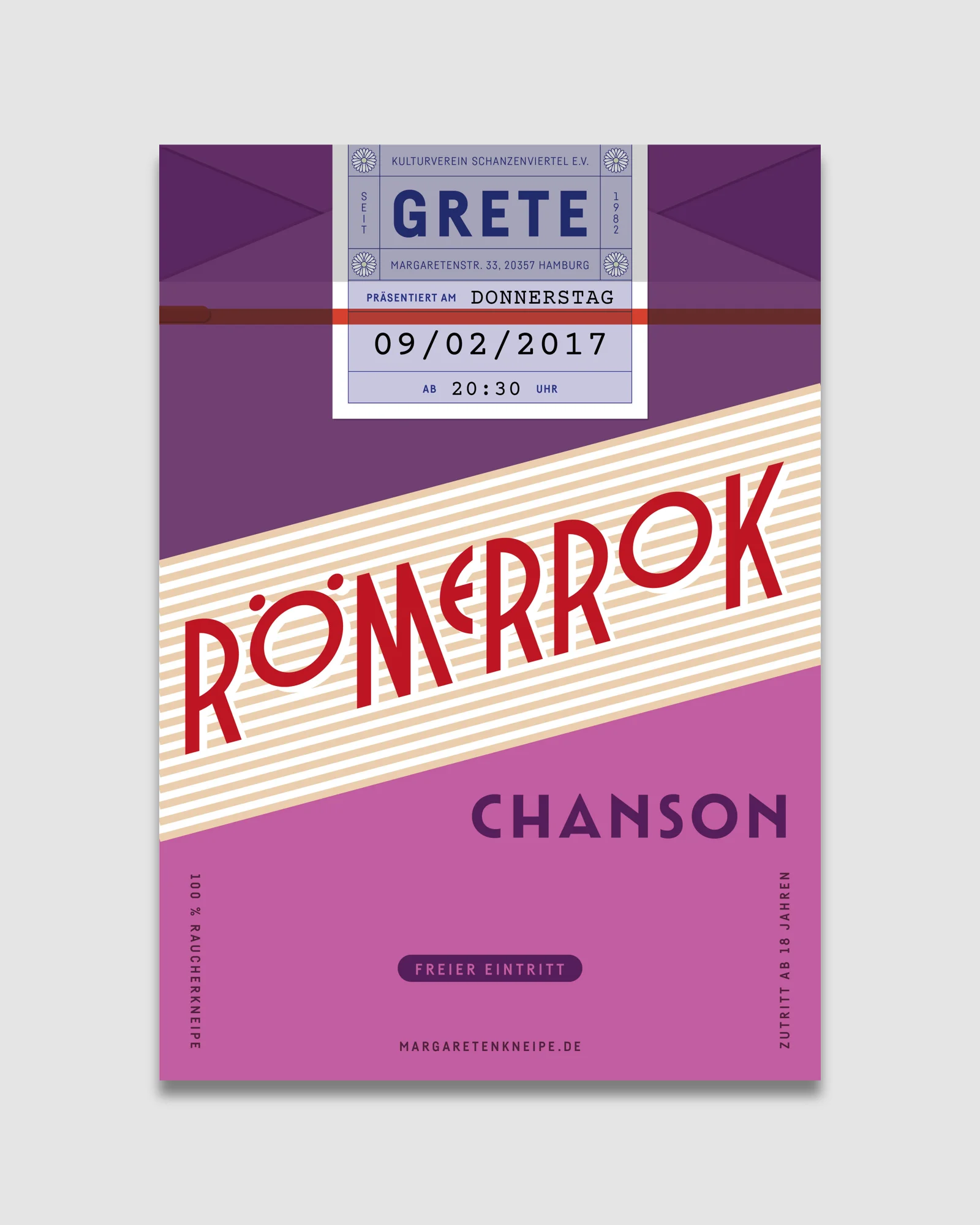
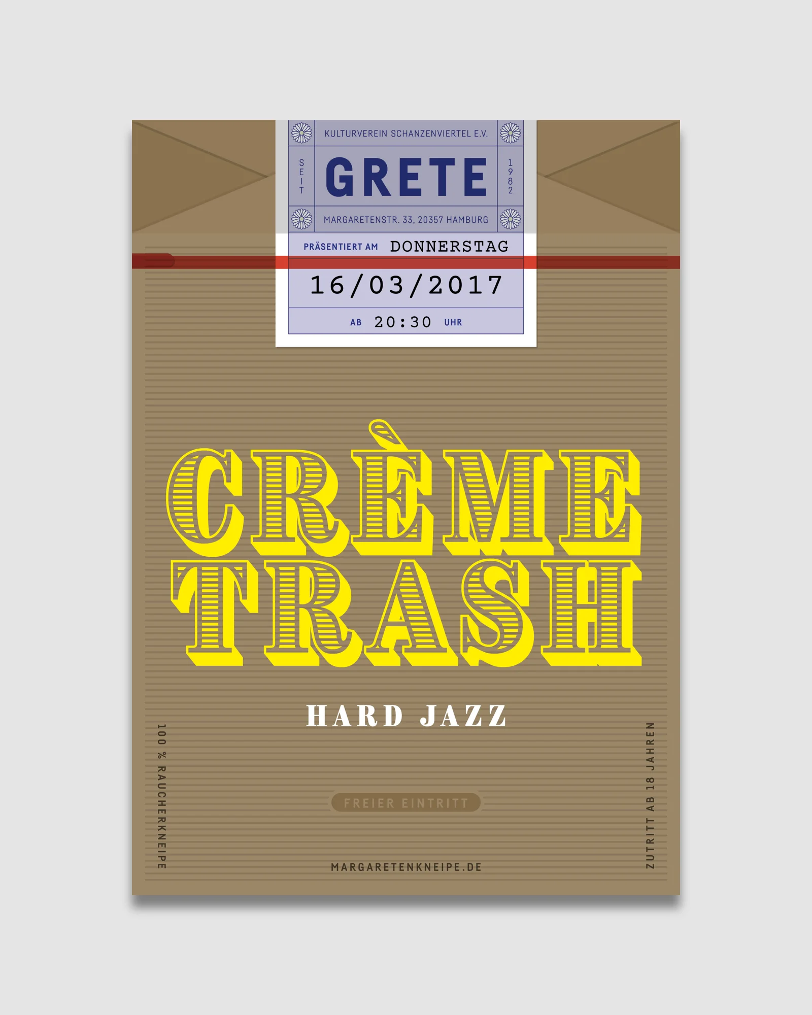
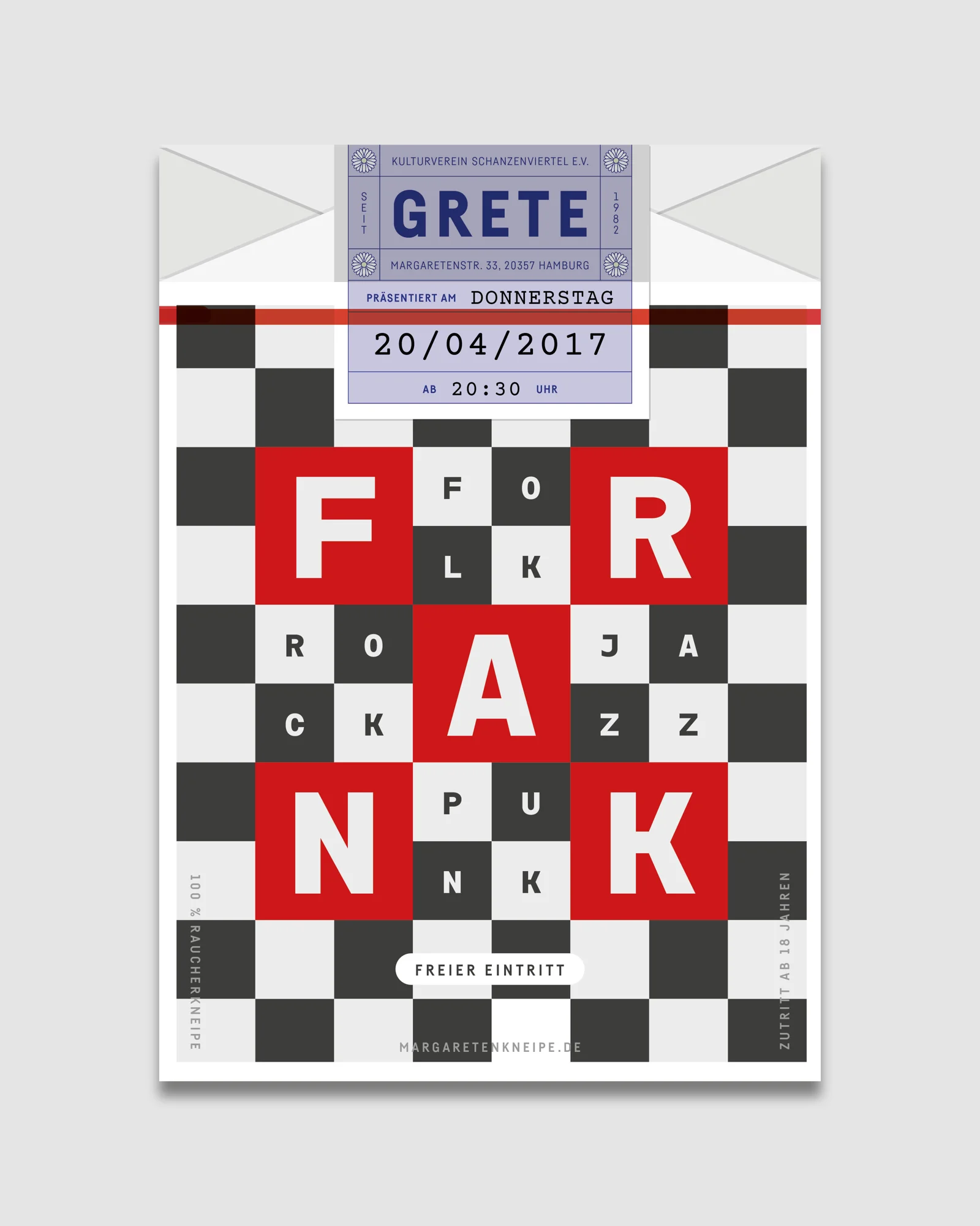
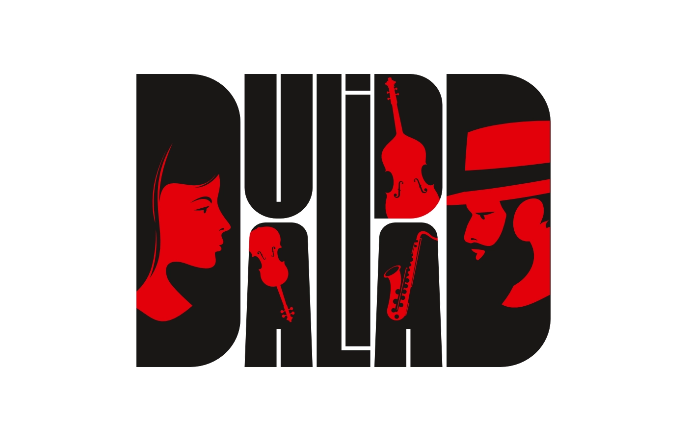
Over time, the system evolved toward using the names as the sole visual element, resulting in expressive typographic compositions.
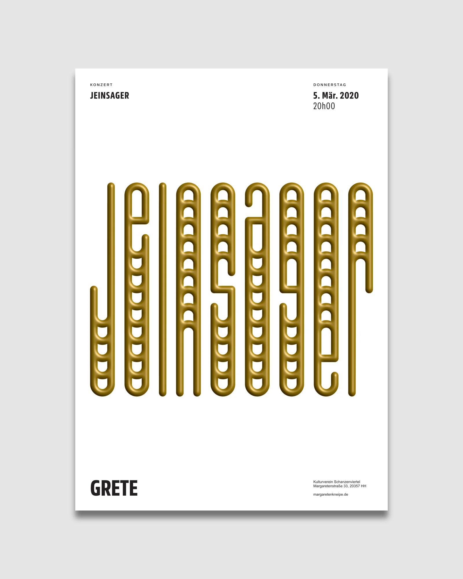
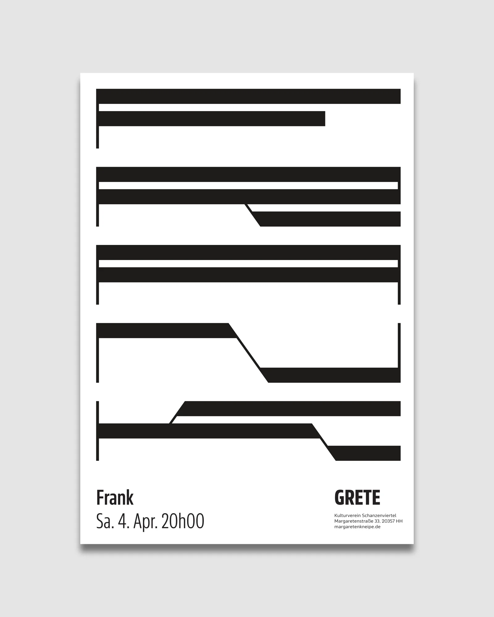
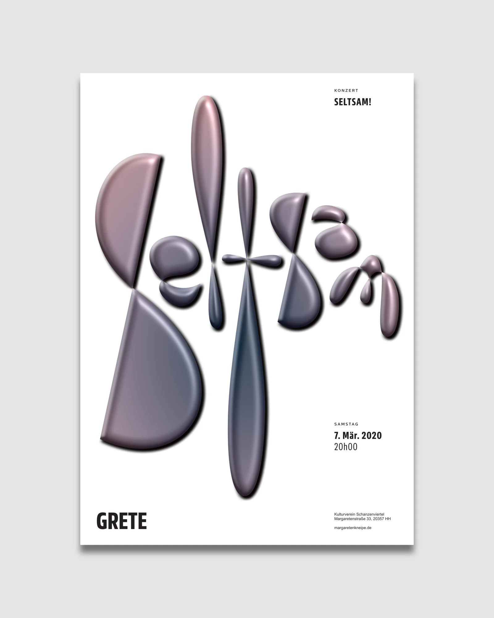
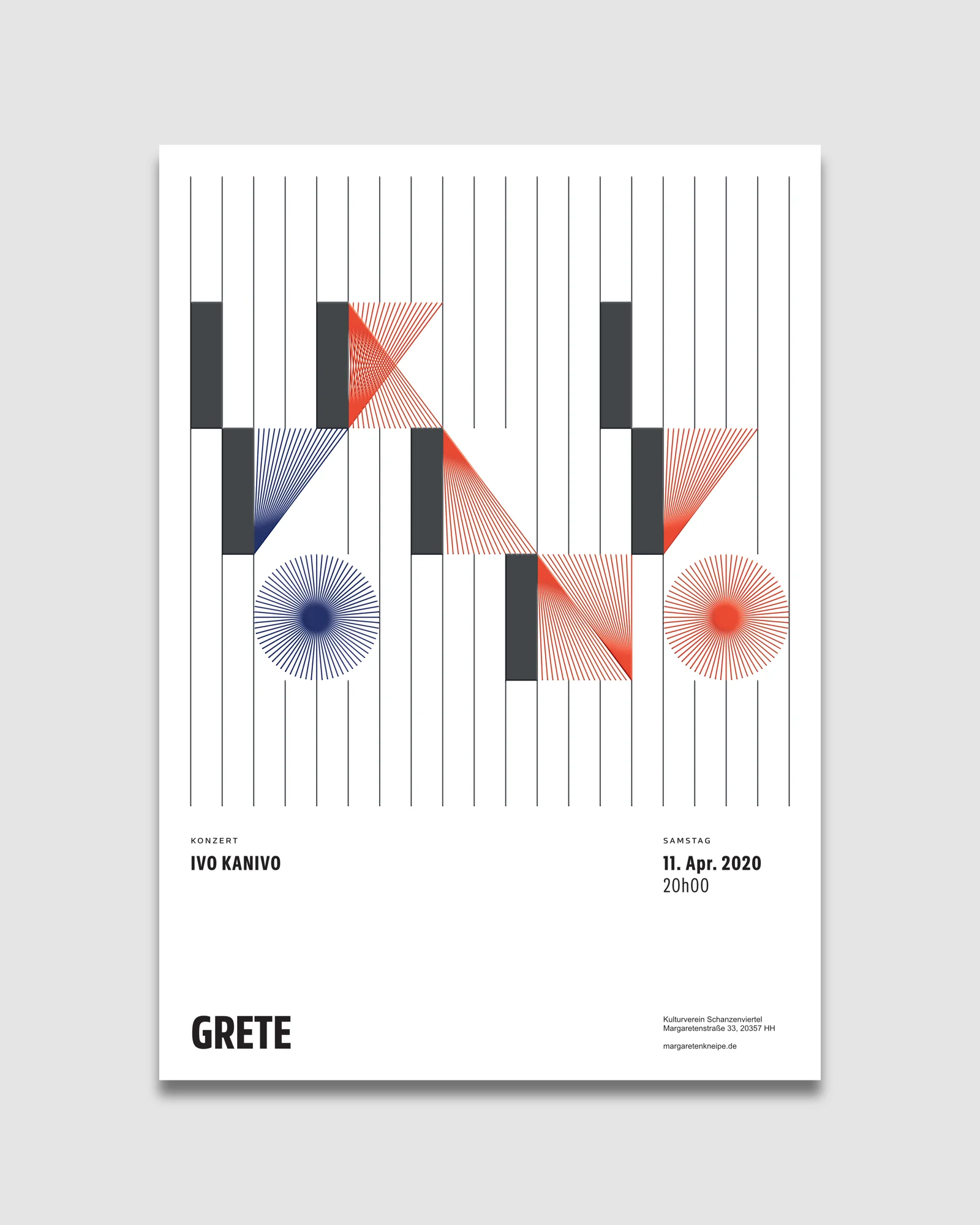
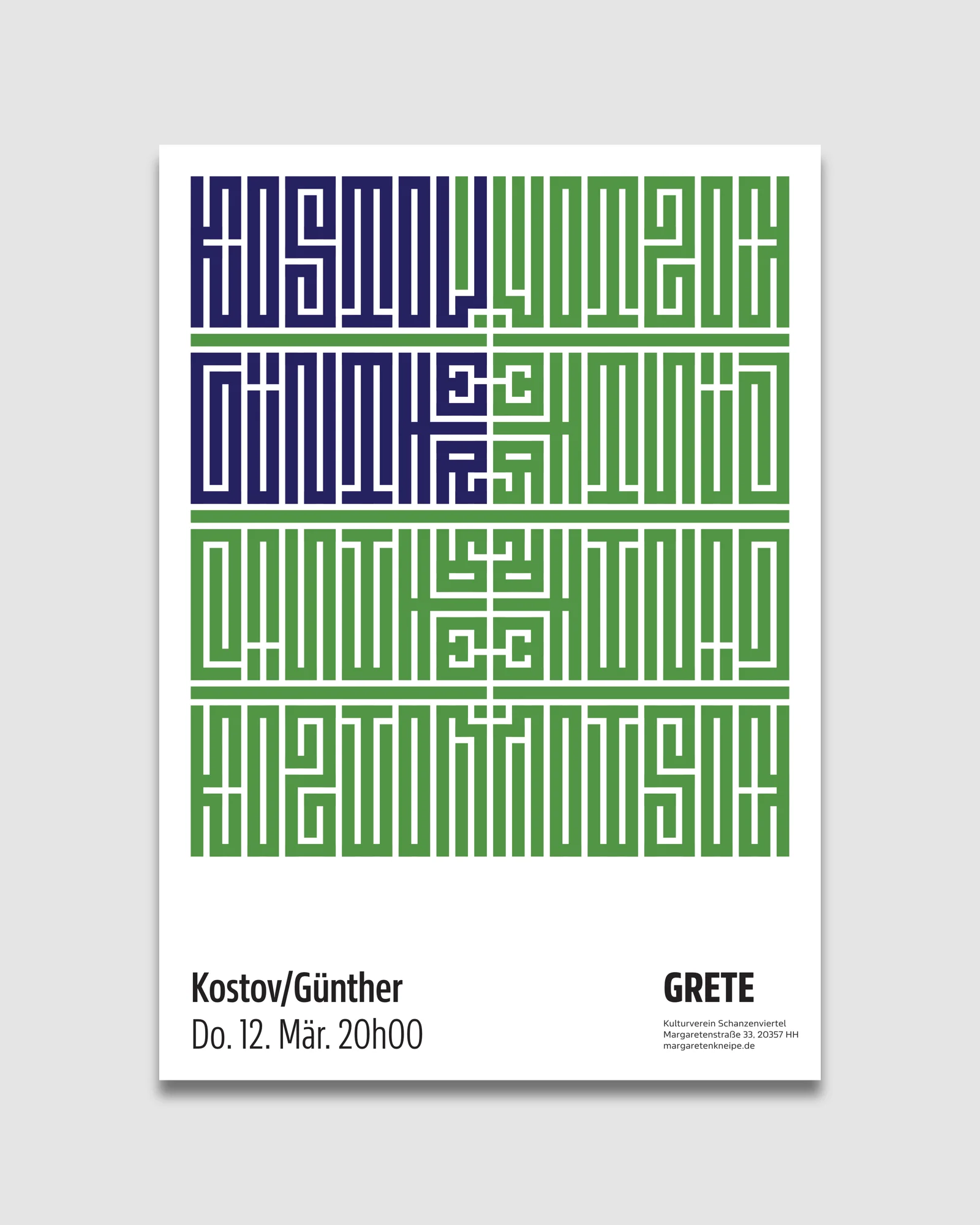
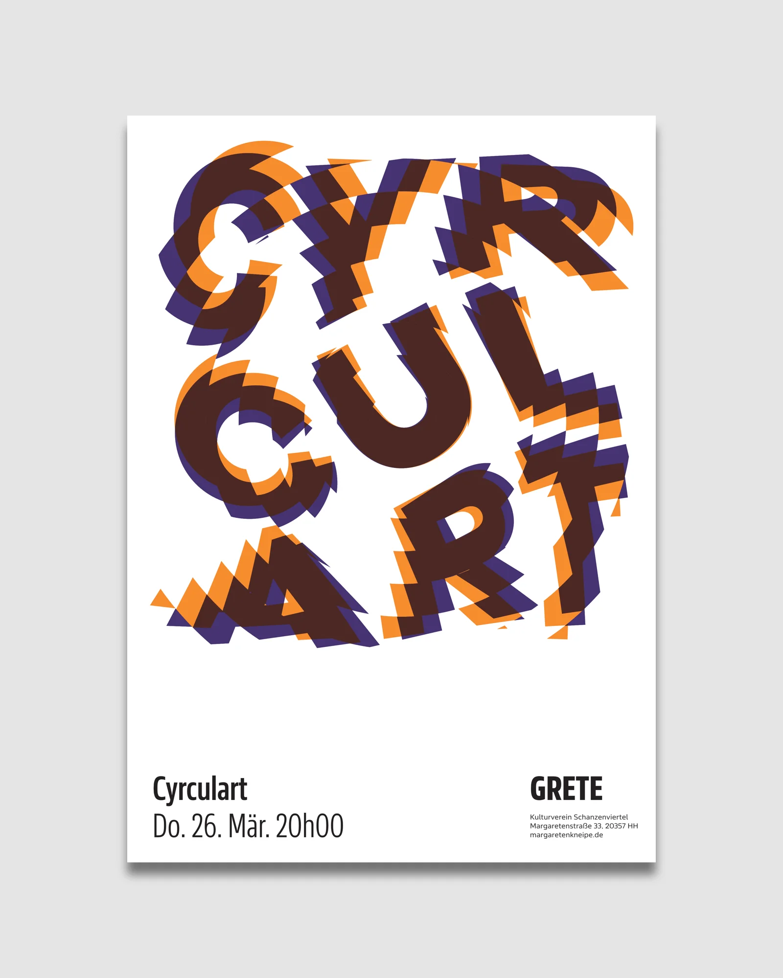
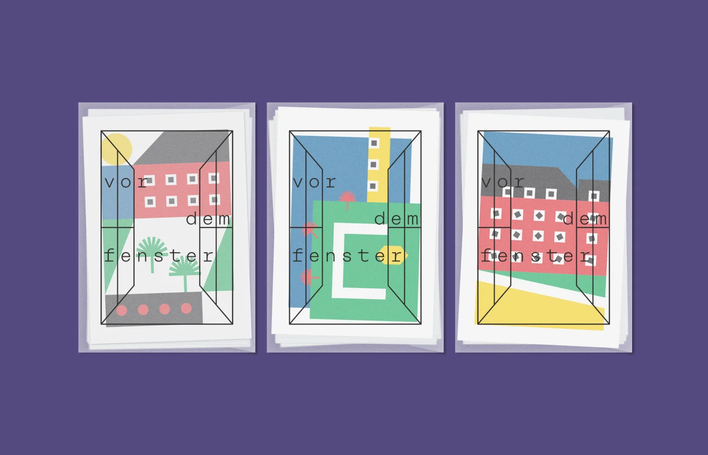
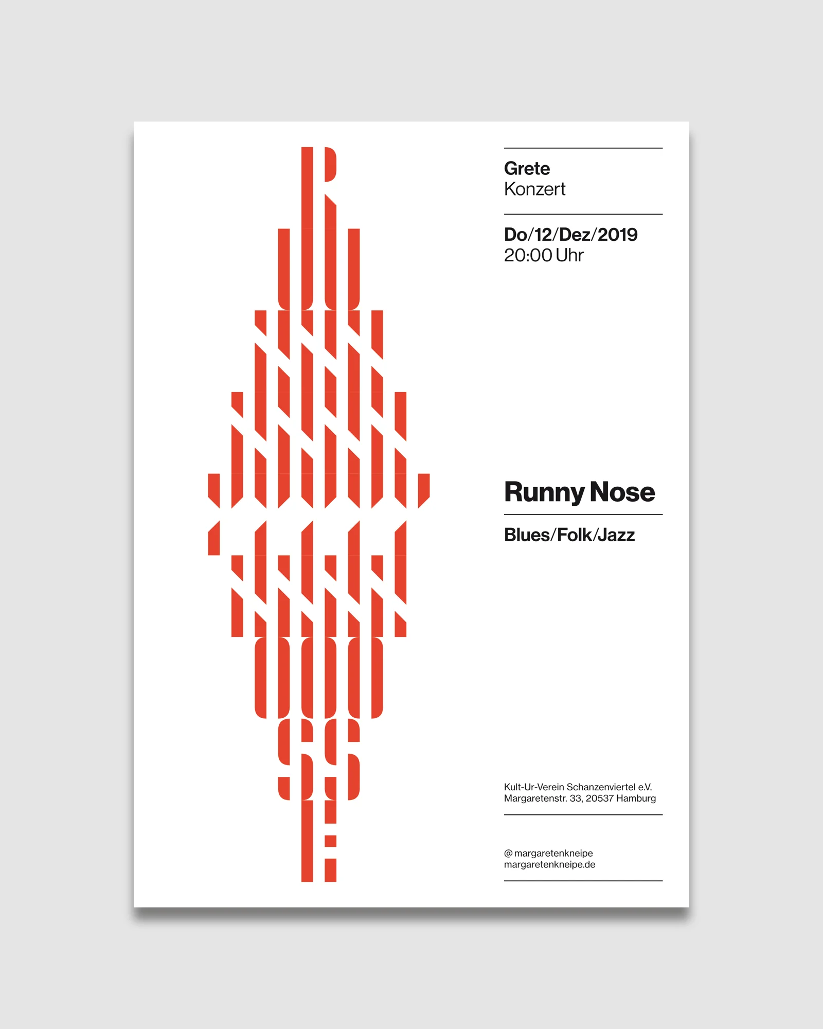
Later iterations introduced a custom stencil typeface to generate structured patterns from the names, prioritising adaptability and coherence while allowing variation within a consistent series.

SETT — A geometric stencil typeface built on equal-width strokes, counters, and letter spacing, creating a distinctive optical rhythm.
Something in here sparked an idea?
Let‘s start with a conversation.
Explore more projects